

If you are trying to create a table in Bricks Builder and cannot find a proper table element, you are not alone. Many Bricks Builder users run into the same problem because Bricks does not provide a complete solution for building different types of tables out of the box.
Although Bricks Builder includes a Pricing Table element, it is still limited when you need data tables, comparison tables, pros and cons tables, or product tables.
The good news is that there are two easy ways to solve this.
You can use a WordPress table plugin like RioVizual that works directly with Bricks Builder, or you can create a table manually using custom HTML and CSS. Both methods work with Bricks Builder.
This guide walks you through both approaches step by step, even if you have never created a table in Bricks Builder before.
Types of Tables You Can Create in Bricks Builder
Bricks Builder does not limit the types of tables you can create. You can build almost any kind of table depending on your content and design needs.
Here are some of the most common table types users create in Bricks Builder:
- Comparison tables: Compare products, tools, or services side by side
- Pricing tables: Display pricing plans with features and CTAs
- Data tables: Present structured data like specifications, stats, or metrics
- Product tables: Showcase products with images, prices, and buttons
- Pros and cons tables: Highlight strengths and weaknesses visually
- Feature tables: Showcase features across multiple plans or versions
Each of these tables can be built quickly using the plugin method.
The HTML method also supports all of them, but it requires manual coding and additional effort for every update or design change.
Our Created Table Preview
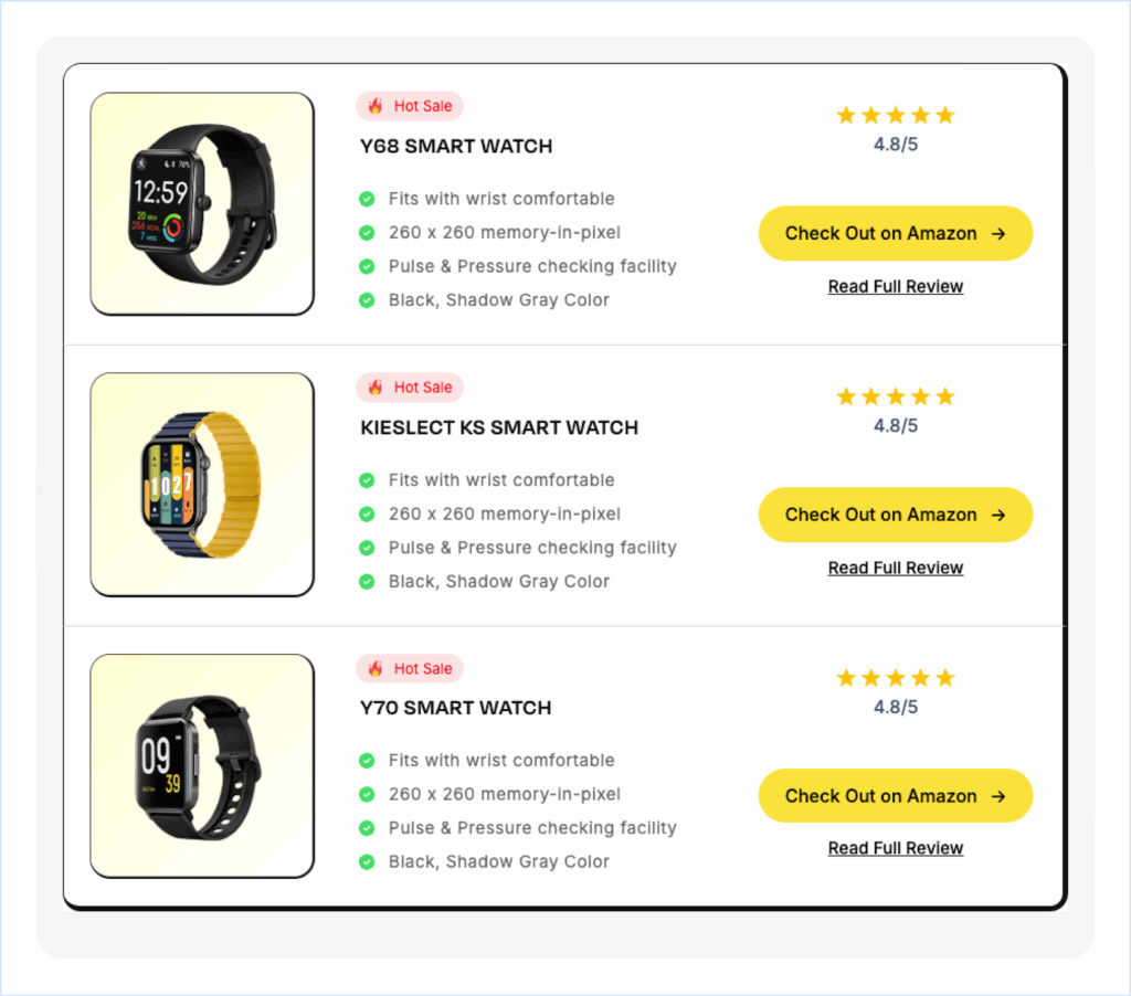
By the end of this guide, you will be able to create tables like this in Bricks Builder using both the plugin and HTML methods.
The same workflow can also be applied to pricing tables, product tables, data tables, and other custom table layouts.
What You Need Before You Start
Before you start creating tables in Bricks Builder, make sure the following requirements are in place:
- The latest version of WordPress is installed.
- Bricks Builder is installed and activated.
- RioVizual is installed and activated. (Required for the plugin method)
Once everything is set up, you can follow either of the methods below for creating tables in a bricks builder.
Method 1: Create a Table in Bricks Builder Using the RioVizual Plugin
RioVizual is a WordPress table plugin that supports the most common table layouts and includes a dedicated element for adding tables anywhere inside Bricks Builder.
It offers two flexible ways to create tables in Bricks Builder, depending on your workflow and customization needs:
- Approach 1: Use pre-designed templates for faster table creation
- Approach 2: Build a table from scratch for full manual customization
Both approaches are covered below.
Approach 1: Create a Table Using a Pre-Designed Template
RioVizual includes a library of 70+ pre-designed table templates, many of them are available for free. This is the fastest way to create a table in Bricks Builder without starting from scratch.
This guide uses the Table Builder block, but you can use any RioVizual blocks based on your needs.
Step 1: Create a New Table from the RioVizual Dashboard
- Go to WordPress Dashboard > RioVizual > Tables
- Click Create New Table
- Enter a name for your table
- Enable the Synced toggle if you want updates to apply across every page where the table is used
- Click Create
- Click the + icon and select Table Builder
Step 2: Select a Pre-Designed Template
- Browse the available templates in the library
- Hover over the template you want to use
- Click Import
Your table will now be created with sample content and styling. You can replace the text, swap images, customize the design, and add your own data directly inside the editor.
Once your table is ready, click Publish to save it.
Step 3: Add the Table to Your Bricks Builder Page
Once your table is published, you can insert it into any page or post in Bricks Builder using the RioVizual element or the Shortcode element.
Option A: Using the RioVizual Element
- Open your page or post in Bricks Builder
- Search for the RioVizual element and insert it into the page
- From the element settings, open the Choose a Table dropdown
- Select the table you created
- Save and publish your changes
Option B: Using a Shortcode
- Go to WordPress Dashboard > RioVizual > Tables
- Copy the shortcode next to the table you want to use
- Open your page or post in Bricks Builder
- Search for the Shortcode element and insert it into the page
- Paste the shortcode into the field and save
Both options let you reuse the same table across multiple pages.
If you update the table in the RioVizual dashboard, those changes will reflect everywhere the table appears, as long as the Synced toggle is enabled.
Approach 2: Build a Table from Scratch
If you prefer to start with a blank canvas and build your table exactly the way you want, use the Build from Scratch option inside RioVizual.
In this approach, we are going to recreate the same table we imported earlier, starting from a blank layout.
Step 1: Start with a Blank Layout
Go to WordPress Dashboard > RioVizual > Tables, create a new table, and open the table editor using the Table Builder block.
We already covered this process in Approach 1 > Step 1.
This time, select Build from Scratch instead of choosing a template.
Step 2: Define the Initial Table Structure
After selecting Build from Scratch, a setup panel will appear. Define the basic structure of your table:
- Column Count: Set to 3
- Row Count: Set to 3
- Cell Border Type: Select Separate cell border
- Click Create Table after setting these values.
Once created, a blank table canvas will appear with an Add Text placeholder inside each cell. This is your starting point.
Step 3: Configure the Table Settings
- Click to the Table settings available in the Top-right corner.
- Go to Settings Panel > General tab
- Enable the Equal Cells width toggle
Step 4: Add Content to Your Table
Now you can start filling your table with content. RioVizual supports multiple element types that you can add to any cell, including images, text, icons, star ratings, and buttons.
4.1: Add Image Element
- Select the target cell where you want to add the image
- Click the + icon in the bottom-right corner of the cell
- Choose Image from the element list
- Open the Settings Panel and go to the General tab
- Enable the Insert from URL toggle
- Paste your image URL into the field
Note: You can also upload images directly from your computer or choose them from the WordPress Media Library.
4.2: Add Media and Text Element
- Select the target cell where you want to add media & text
- Click the + icon in the bottom-right corner
- Choose Media & Text from the element list
- Click the Add Text placeholder and type your content
- Open Settings Panel > General tab
- Enable the Insert from URL toggle to add media
- Paste your image URL into the field
To save time, duplicate this element across multiple cells:
- Right-click the Media & Text element and select Copy Element
- Right-click on the other target cells and select Paste Element
You can remove the default Add Text placeholder to any cell by right-clicking it and selecting Delete Element.
4.3: Add Text Element
- Select the cell where you want to add the text
- Click the + icon in the bottom-right corner
- Choose Text from the element list
- Click the Add Text placeholder and type your content
4.4: Add Advanced List Element
- Select the target cell
- Click the + icon in the bottom-right corner
- Choose Advanced List from the element list
- Open Settings Panel > General tab
- Select each List item and add:
- Text: Add text for the list item
- Select Icon: Add icon that appear next to the list item
You can also add, duplicate, or remove list items as needed.
4.5: Add Star Rating Element
- Select the target cell
- Click the + icon in the bottom-right corner
- Choose Star Rating from the element list
- Open Settings Panel > General tab and configure:
- Rating Value: 4.8
- Rating Scale: 5.0
- Enable Show Rating Value and apply:
- Rating Value Style: Numeric
- Rating Value Position: Bottom
4.6: Add Advanced Button
- Select the target cell
- Click the + icon in the bottom-right corner
- Choose Advanced Button from the element list
- Add your button text (CTA) in the Add Text field
- Go to Settings Panel > General tab > Add URL
- Paste your Destination link into the Add URL field
4.7: Add Button Element
- Select the target cell
- Click the + icon in the bottom-right corner
- Choose Button from the element list
- Add your button text (CTA) in the “Add Text” field
- Open the Settings Panel → General tab
- Paste your destination link into the Add URL field
Note: Note: Both the Advanced Button and Button Element support Open in New Tab and Add NoFollow to Link options.
Step 5: Style the Table Elements
Now that all the content is in place, it is time to style each element. This step covers the styling settings for every element you added in Step 4 including the entire table layout.
5.1: Style the Image Element
- Open Global Style from the Settings Panel or Block Toolbar.
- Expand the Image settings and apply:
- Sizing > Width: 200px
- Alignment > Horizontal: Middle
5.2: Style the Media and Text Element
- Open Global Style from the Settings Panel or Block Toolbar.
- Expand the Media & Text settings
- In the Wrapper Style Apply:
- Text Color: #FF0000
- Background: Classic
- Background Color: #FFE4E4
- Typography:
- Font Weight: 400
- Font Size: 13px
- Border > Border Radius: 35px (all sides)
- Spacing:
- Padding: 3px (Top, Bottom)
- Margin: 6px (Bottom)
- Alignment:
- Horizontal: Middle
- Vertical: Center
ℹ️ Some styling options in the settings panel, such as Background, Typography, and Border may not appear immediately by default. Click the (⋮) three-dot menu next to theWrapper Style to access additional controls.
5.3: Style the Text Element
- From Global Style expand the Text Style settings and apply:
- Color: #141414
- Typography:
- Font Weight: 600
- Font Size: 20px
- Letter Spacing: 0.5px
- Text Transformation: Capitalize
- Spacing:
- Margin: 16px (Bottom)
ℹ️ Some styling options in the settings panel, such as Typography may not appear immediately by default. Click the (⋮) three-dot menu next to theText Style to access additional controls.
5.4: Style the Advanced List
- From Global Style expand the Advanced List settings and apply:
- Icon Style:
- Gap: 8px
- Size: 14px
- Color: #08DC64
- Item Style:
- Color: #666666
- Typography:
- Font Weight: 400
- Font Size: 15px
- Line Height: 24px
- Letter Spacing: 0.5px
- Icon Style:
5.5: Style the Star Rating
- From Global Style expand the Star Rating settings and apply:
- Icon Style:
- Fill Color: #FFC300 (rated stars)
- Unfill Color: #F6F6F6 (unrated stars)
- Wrapper Style:
- Spacing > Margin: 40px (Bottom)
- Alignment: Middle (Horizontal)
- Icon Style:
5.6: Style the Advanced Button
The Advanced Button has two states: Normal and Hover. Apply the following settings to both:
Start with Normal State:
- Open Global Style > expand Adv. Button and apply:
- Icon Style:
- Gap: 12px
- Size: 14px
- Button Style:
- Color: #000000
- Background: Classic
- Background Color: #FFE23D
- Typography:
- Font Weight: 500
- Font Size: 16px
- Border > Border Radius: 35px (all corner)
- Alignment > Horizontal: Middle
- Icon Style:
Now switch to Hover state from the Settings Panel and within the Adv. Button style apply the following changes:
- Button Style:
- Color: #000000
- Background: Classic
- Background: #FFD900
5.7 Style the Button
The Button has two states: Normal and Hover. Apply the same settings to both.
Start with Normal State:
- Open Global Style > expand Button and apply:
- Color: #000000
- Background: Classic
- Background Color: #00000000
- Typography:
- Font Weight: 500
- Font Size: 15px
- Text Decoration: Underline
- Alignment > Horizontal: Middle
Now switch to Hover state from the Settings Panel and within the Button style apply the following changes:
- Color: #B09600
- Background: Classic
- Background Color: #000000
- Typography:
- Font Weight: Default
- Font Size: 16px
And this is it. Your table is now fully built and styled from scratch. To add it to any page or post using Bricks builder follow the same steps from Approach 1 > Step 3 as we have described earlier.
Method 2: Create a Table in Bricks Builder Without a Plugin (HTML/CSS)
You can also create a table manually in Bricks Builder using custom HTML and CSS. This method gives you full control over the table structure and styling, but it requires basic HTML and CSS knowledge.
Important for beginners: This method works best for simple or one-time tables. If you plan to create and manage multiple tables across your site, the plugin method is faster, easier to maintain, and more scalable.
The HTML and CSS Code
<link rel="preconnect" href="https://fonts.googleapis.com">
<link rel="preconnect" href="https://fonts.gstatic.com" crossorigin>

<link href="https://fonts.googleapis.com/css2?family=Inter:wght@400;500;600&display=swap" rel="stylesheet">

<style>

.rv-watch-table-wrapper{
    font-family:'Inter',sans-serif;
    background:#ffffff;
    border:5px solid #141414;
    border-radius:20px;
    overflow:hidden;
    max-width:1200px;
    margin:auto;
}

.rv-watch-row{
    display:flex;
    align-items:center;
    gap:30px;
    padding:24px 18px;
    border-bottom:1px solid #dadada;
}

.rv-watch-row:last-child{
    border-bottom:none;
}

.rv-watch-image{
    width:220px;
    flex-shrink:0;
    text-align:center;
}

.rv-watch-image img{
    width:200px;
    display:block;
    margin:auto;
}

.rv-watch-content{
    flex:1;
}

.rv-hot-sale{
    display:inline-flex;
    align-items:center;
    gap:8px;
    background:#FFE4E4;
    color:#FF0000;
    padding:4px 14px;
    border-radius:35px;
    font-size:13px;
    font-weight:400;
    margin-bottom:10px;
}

.rv-hot-sale img{
    width:14px;
    height:14px;
}

.rv-watch-content h3{
    font-size:20px;
    font-weight:600;
    letter-spacing:0.5px;
    color:#141414;
    margin:0 0 16px;
}

.rv-feature-list{
    list-style:none;
    padding:0;
    margin:0;
}

.rv-feature-list li{
    position:relative;
    padding-left:28px;
    margin-bottom:10px;
    color:#666666;
    font-size:15px;
    line-height:24px;
    letter-spacing:0.5px;
}

.rv-feature-list li::before{
    content:"✔";
    position:absolute;
    left:0;
    top:0;
    color:#08DC64;
    font-size:14px;
    font-weight:bold;
}

.rv-watch-action{
    width:300px;
    text-align:center;
    flex-shrink:0;
}

.rv-rating{
    margin-bottom:40px;
}

.rv-stars{
    color:#FFC300;
    font-size:28px;
    line-height:1;
}

.rv-rating-text{
    font-size:16px;
    font-weight:600;
    color:#5F6780;
    margin-top:8px;
}

.rv-amazon-btn{
    display:inline-flex;
    align-items:center;
    justify-content:center;
    gap:12px;
    background:#FFE23D;
    color:#000000;
    text-decoration:none;
    font-size:16px;
    font-weight:500;
    padding:18px 30px;
    border-radius:35px;
    transition:0.3s ease;
    margin-bottom:18px;
}

.rv-amazon-btn:hover{
    background:#FFD900;
}

.rv-amazon-btn span{
    font-size:18px;
}

.rv-review-link{
    display:inline-block;
    color:#000000;
    font-size:15px;
    font-weight:500;
    text-decoration:underline;
    transition:0.3s ease;
}

.rv-review-link:hover{
    color:#B09600;
}

/* Responsive */

@media (max-width:991px){

    .rv-watch-row{
        flex-direction:column;
        text-align:center;
    }

    .rv-watch-content{
        width:100%;
    }

    .rv-feature-list li{
        text-align:left;
    }

    .rv-watch-action{
        width:100%;
    }

}

@media (max-width:767px){

    .rv-watch-row{
        padding:20px 15px;
    }

    .rv-watch-image{
        width:100%;
    }

    .rv-watch-image img{
        width:160px;
    }

    .rv-watch-content h3{
        font-size:18px;
    }

    .rv-amazon-btn{
        width:100%;
        padding:16px 20px;
    }

}

</style>

<div class="rv-watch-table-wrapper">

    <!-- ================= ROW 1 ================= -->

    <div class="rv-watch-row">

        <div class="rv-watch-image">
            <img src="https://riovizual.com/wp-content/uploads/2025/03/watch-image-01.png" alt="Watch Image">
        </div>

        <div class="rv-watch-content">

            <div class="rv-hot-sale">
                <img src="https://riovizual.com/wp-content/uploads/2025/03/fire-icon.png" alt="Fire Icon">
                <span>Hot Sale</span>
            </div>

            <!-- CHANGE PRODUCT TITLE -->
            <h3>Y68 SMART WATCH</h3>

            <!-- CHANGE FEATURES -->
            <ul class="rv-feature-list">
                <li>Fits with wrist comfortable</li>
                <li>260 x 260 memory-in-pixel</li>
                <li>Pulse & Pressure checking facility</li>
                <li>Black, Shadow Gray Color</li>
            </ul>

        </div>

        <div class="rv-watch-action">

            <div class="rv-rating">
                <div class="rv-stars">★★★★★</div>

                <!-- CHANGE RATING -->
                <div class="rv-rating-text">4.8/5</div>
            </div>

            <!-- CHANGE BUTTON LINK -->
            <a href="#" class="rv-amazon-btn">
                Check Out on Amazon
                <span>→</span>
            </a>

            <!-- CHANGE REVIEW LINK -->
            <br>

            <a href="#" class="rv-review-link">
                Read Full Review
            </a>

        </div>

    </div>

    <!-- ================= ROW 2 ================= -->

    <div class="rv-watch-row">

        <div class="rv-watch-image">
            <img src="https://riovizual.com/wp-content/uploads/2025/03/watch-image-02.png" alt="Watch Image">
        </div>

        <div class="rv-watch-content">

            <div class="rv-hot-sale">
                <img src="https://riovizual.com/wp-content/uploads/2025/03/fire-icon.png" alt="Fire Icon">
                <span>Hot Sale</span>
            </div>

            <h3>KIESLECT KS SMART WATCH</h3>

            <ul class="rv-feature-list">
                <li>Fits with wrist comfortable</li>
                <li>260 x 260 memory-in-pixel</li>
                <li>Pulse & Pressure checking facility</li>
                <li>Black, Shadow Gray Color</li>
            </ul>

        </div>

        <div class="rv-watch-action">

            <div class="rv-rating">
                <div class="rv-stars">★★★★★</div>
                <div class="rv-rating-text">4.8/5</div>
            </div>

            <a href="#" class="rv-amazon-btn">
                Check Out on Amazon
                <span>→</span>
            </a>

            <br>

            <a href="#" class="rv-review-link">
                Read Full Review
            </a>

        </div>

    </div>

    <!-- ================= ROW 3 ================= -->

    <div class="rv-watch-row">

        <div class="rv-watch-image">
            <img src="https://riovizual.com/wp-content/uploads/2025/03/watch-image-03.png" alt="Watch Image">
        </div>

        <div class="rv-watch-content">

            <div class="rv-hot-sale">
                <img src="https://riovizual.com/wp-content/uploads/2025/03/fire-icon.png" alt="Fire Icon">
                <span>Hot Sale</span>
            </div>

            <h3>Y70 SMART WATCH</h3>

            <ul class="rv-feature-list">
                <li>Fits with wrist comfortable</li>
                <li>260 x 260 memory-in-pixel</li>
                <li>Pulse & Pressure checking facility</li>
                <li>Black, Shadow Gray Color</li>
            </ul>

        </div>

        <div class="rv-watch-action">

            <div class="rv-rating">
                <div class="rv-stars">★★★★★</div>
                <div class="rv-rating-text">4.8/5</div>
            </div>

            <a href="#" class="rv-amazon-btn">
                Check Out on Amazon
                <span>→</span>
            </a>

            <br>

            <a href="#" class="rv-review-link">
                Read Full Review
            </a>

        </div>

    </div>

</div>
Note: Replace the sample content with your own before publishing. You can update product titles inside the <h3> tags, image URLs and alt text inside the <img> tags, feature text inside the <li> tags, rating values inside the .rv-rating-text element, and button or review links inside the <a href=”#”> tags.
How to Insert the HTML Table in Bricks Builder
- Open your page or post in Bricks Builder
- Click the + Add Element button
- Search for the Code element and insert it into the page
- Paste the complete HTML and CSS code inside the Code element
- Click Save or Publish
Your table will now appear on the page using the styling defined in the code.
Note: The CSS is already included inside the <style> tag, so you do not need to add separate CSS files or custom CSS settings in Bricks Builder.
Making Your Bricks Builder Table Responsive
Mobile responsiveness is one of the most overlooked parts of table design. A table that looks clean on a desktop can quickly become difficult to read on smaller screens if it is not properly optimized.
Without responsive settings users may need to zoom, scroll sideways, or struggle to read your table content on mobile devices.
Responsive Options in the Plugin Method (RioVizual)
RioVizual includes built-in responsive controls so you can adjust how your tables look across different screen sizes directly from the editor.
You can access these settings from: Table Settings > General tab > Responsiveness
Here are the most useful responsive features available:
- Enable Scrollbar on Large Devices: Adds horizontal scrolling when table content exceeds the container width. This is especially useful for wide comparison tables and data tables with many columns.
- Responsive Mode: RioVizual includes multiple responsive modes such as Responsive, Scrollable, and Stack. These modes automatically adjust the table layout for smaller screens by enabling horizontal scrolling or stacking content vertically for better readability.
- Sticky: Makes the first row or first column sticky so users can still see row and column labels while scrolling through large tables. Useful for comparison tables and data tables.
- Desktop, Tablet, and Mobile Controls: RioVizual includes separate responsive controls for each device type. You can customize styling, spacing, alignment, and content visibility independently for each screen size while previewing the result in real time.
Responsive Options in the HTML/CSS Method
If you are using the manual HTML method, you need to handle responsiveness yourself. The code provided in this guide already includes a basic media query for smaller screens.
For tables with many columns, horizontal scrolling is usually the best approach on mobile. Use the following CSS to enable it:
css
.table-wrapper {
  overflow-x: auto;
  -webkit-overflow-scrolling: touch;
}
General Responsive Guidelines for Any Method
- Avoid using more than 4 to 5 columns on mobile layouts
- Keep cell text short to prevent overflow issues
- Test on real devices, not just browser resize tools
- Make buttons and clickable elements large enough to tap comfortably
- Use scrolling or stacked layouts for large tables on mobile
Which Method should you apply?
Both methods work for creating tables in Bricks Builder, but the right choice depends on how much time you want to spend and how much flexibility and scalability you need.
Use the Plugin Method (RioVizual): This is the better option for most users, especially beginners. It makes table creation faster with pre-designed templates, built-in responsiveness, reusable tables, and centralized table management across your entire site.
Use the HTML/CSS Method: This method works best when you only need one or two static tables and prefer full manual control over the structure and styling. It is more suitable for users who are comfortable working with HTML and CSS.
Looking for more options? Check out our guide to the Best WordPress Table Plugins to compare all available choices.

Leave a comment