
Tables and charts are both widely used data representation techniques in almost every industry.
But are there any differences between them and when should use tables or charts?
In this post, we will explore the differences between tables vs charts and find out their use case.
What is a Table?
A table is a collection of raw data organized in rows and columns. It is used to store and organize data for analysis. Each row represents a separate record, while each column represents a separate data attribute.
Tables display data precisely and clearly, so you can see the exact numbers you’re working with. That’s why, it enables you to analyze the presented information quickly and clearly.
What is a Chart?
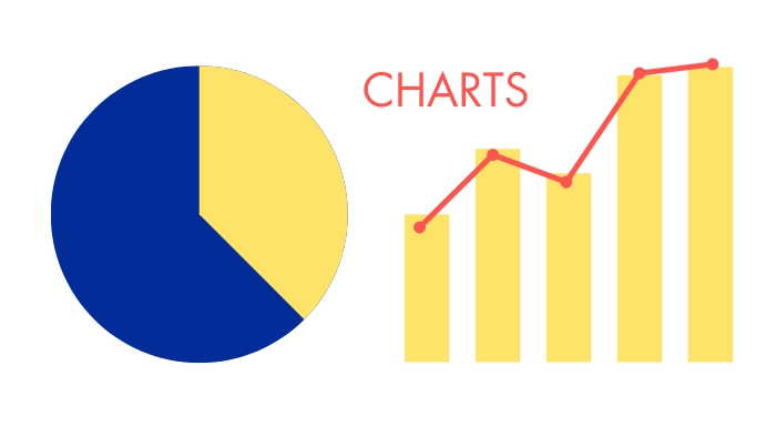
A chart is a graphical representation of important information that is derived from a source of raw data, like a table. They are designed to make information easier to understand and are usually represented by symbols and diagrams.
Charts can be simple or complex, depending on the amount of data and the level of detail required. All around they are an essential tool for data visualization, helping to simplify complex information and make it easier to process.
Table vs Chart- What is the Difference Between Charts and Tables?
Let’s see the basic differences between tables and charts.
| Aspect | Table | Chart |
| Best For | Displaying precise and raw data or information | Presenting information derived from raw data to visualize trends, patterns, and relationships |
| Goal | To present raw data in a structural format | To visualize information |
| Data Type | Quantitative data | Both Quantitative and qualitative data |
| Representation | Numbers and text in rows and columns | Graphics such as lines, bars, and circles |
| Features | Text and numbers | Graphics and numbers with little text |
| Precision | Provides precise numerical values | Provides approximate values |
| Engagement | Low | High |
| Interactivity | High | Low |
With the differences all sorted out, let’s check out when to use which.
Tables vs Charts: Which One Should You Use and When?
Tables are best for presenting raw, precise individual values or when accurate data demands specific attention, while charts present analyzed data in visualizing patterns, trends, and relationships.
Raw Data vs Processed Information
Tables are the perfect tool when you want to present raw data and charts are better for showcasing information derived from that raw data.
Let’s think about a company’s quarterly sales figures over several years.
Now, a table is great if you want the exact amount of sales. But if you want to present the information that’s hidden beneath the numbers, a chart would be ideal.
With one look at this chart, you know which product is doing well and in which quarter, even though you do not have the precise data.
Accurate Value vs Approximate Assumption
Tables give you the exact value for different attributes of an entity but charts give you approximate but comparable information.
Using the columns in the table, you can easily locate information about specific fruits, such as the price of an orange or the calorie content of a banana.
But if you make it into a bar chart, you won’t have the exact attributes, but you can easily compare them.
Also, there are different chart types for better data visualization. Like, a pie chart is a good choice for comparing the proportions of different categories within a broader category.
Like all mobile phone users, 57% of people use Android, 23% use iPhones, and 20% use other operating systems.
Now, let’s see what the table version of this pie chart would look like-
| Number of People Interviewed | 473,891 |
| Android Users | 270,117 |
| iPhone Users | 108,994 |
| Others | 94,778 |
Tracking Trends Over Time
Charts are also better than tables for tracking trends over time. For reference, a line chart is a great choice for showing a trend over time.
One look at this chart and you can conclude that the company had a steady subscriber growth over the year. But if you turn this into a table, you don’t have the information on growth until you analyze the data from the table.
| Month | Number of Subscribers |
| January | 10,000 |
| February | 15,000 |
| March | 12,000 |
| April | 30,000 |
| May | 26,000 |
| June | 50,000 |
| July | 47,000 |
| August | 70,000 |
| September | 80,000 |
| October | 76,000 |
| November | 100,000 |
| December | 120,000 |
Relationship Between Variables
Charts are also better than tables when it comes to convey a message contained in the data or to illustrate a relationship between variables.
For example, let’s make a chart correlating the variables “how many hours studied” with the “grades achieved.”
From this bar chart, you can easily say that there’s a pattern or relation between studying and the grade percentage, which is the more you study, the better grades you get.
Presenting Non-numerical Information
Tables are better than charts if you want to show non-numerical information in a structured format, you have to use tables.
For example, tables are used to display meeting agendas with certain times, topics, locations, and speakers.
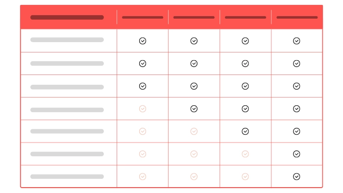
Or, if you want to compare or present information about unquantifiable entities. For example, comparing Gutenberg and page builders.
In such cases, where you work with immeasurable things, cannot use charts to present information.
Present Data In the Best Possible Format
Now that you know the differences between charts and tables, you should also know how to use each effectively.
With the right use of tables and charts, you can create better content and engage your readers and audiences more naturally.
FURTHER READING:

Leave a comment