Table Builder block lets you create fully customizable and responsive tables for various purposes. It offers 6 table elements, each with its own unique settings and customization options.
The Table Builder block also provides 27 premade templates for free. In this guide, we will introduce you with the ins and outs of RioVizual’s Table Builder block.
Adding the Table Builder Block #
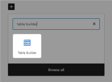
- Navigate to the page or post where you want to add a table.
- Click the “+” button, search for “Table Builder,” and insert it.
- Next, choose from two table creation options:
- Template: Hover over any template to insert it. After inserting a template, you can easily edit the content to fit your needs.
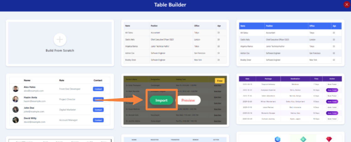
- Build From Scratch: Select this option to create a table from the ground up. You’ll be taken to a new interface where you can customize:
- Header Section: Toggle on to include a header row for your table.
- Footer Section: Toggle on to add a footer row.
- Table Style: Choose between default or striped table styles.
- Cell Border Types: Select between “collapse” or “separator” styles for cell borders.
- Column Count: Set the desired number of columns for your table.
- Row Count: Define the number of rows you want in your table.
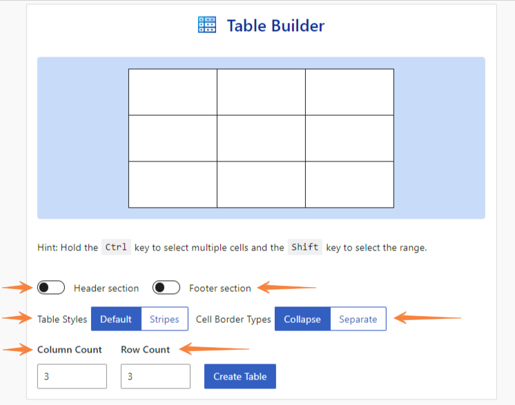
After making necessary changes, when you click on “Create Table,” you will see a table with these things:
- Block Toolbar
- Global Settings
- Initial Table Structure
- Block Settings
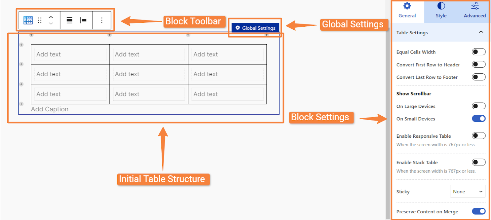
We will break down each of these components in detail in the following sections.
1. Block Toolbar #
After inserting the block, the toolbar will display some default options. However, when you click on any cell within the table, 4 options specific to the Table Builder block will appear:
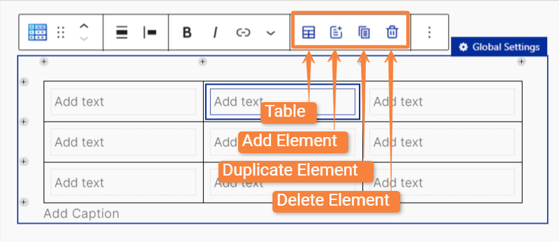
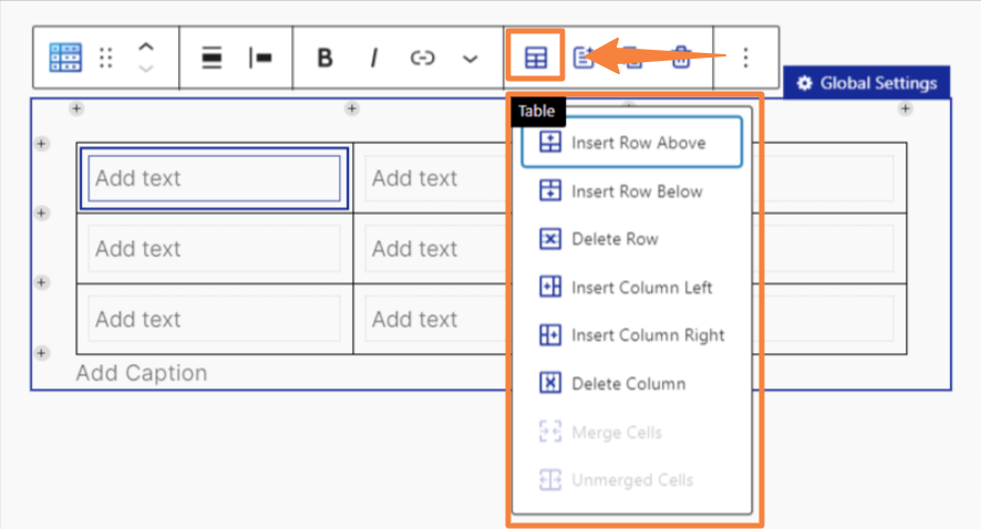
1.1: Table: #
Inside the table option, you will get the following settings:
- Insert Row Above/Below: To add a new row either above or below the selected cell.
- Delete Row: To remove the entire row containing the selected cell.
- Insert Column Left/Right: To add a new column either to the left or right of the selected cell.
- Delete Column: To delete the entire column that contains the selected cell.
- Merge Cells: To combine multiple selected cells into one.
- Unmerged Cells: To split previously merged cells back into individual cells.
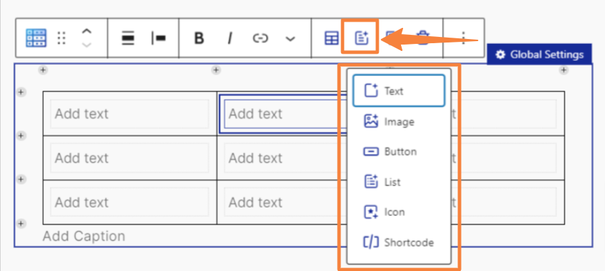
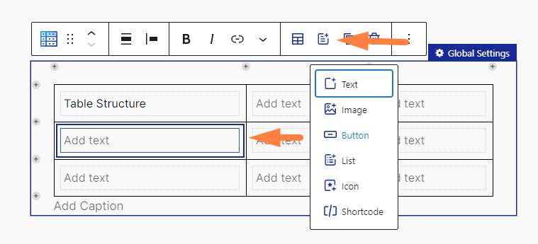
1.2: Add Element: #
When you will click on “Add Element” you will see a list of all the available table elements:
- Text: To add plain text directly to the table cells.
- Image: To insert an image into the table cell.
- Button: To add a clickable button into the table cell.
- List: To to create bulleted lists
- Icon: To insert icons into the table cell.
- Shortcode: To embed predefined code snippets to add custom functionality into the table cell.
1.3: Duplicate Element: #
To create an exact copy of the selected element within the chosen cell.
1.4: Delete Element: #
To remove the selected element from the table.
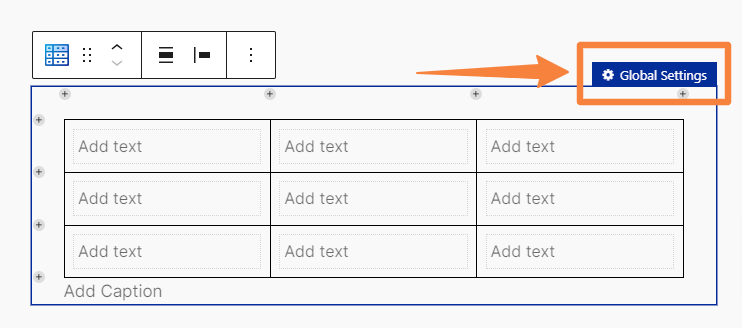
2. Global Settings #
When you click on the global settings, your table enters a global state, displaying only global settings in the block settings panel. As a result, any changes you make using those settings will apply to the entire table. For example, changing the text color in the “Text” settings will affect all text throughout the table.
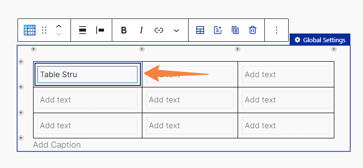
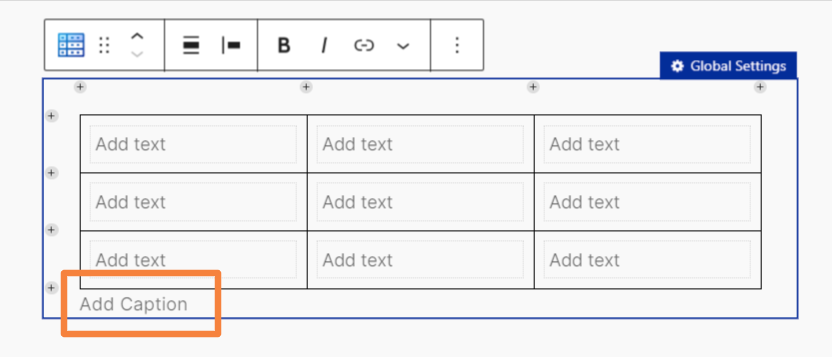
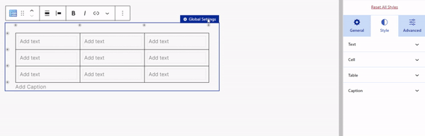
3. Initial Table Structure #
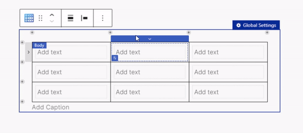
Upon inserting the block, each cell will display placeholder text that says “Add text.” You can easily edit the text by clicking directly on a cell.
To add other elements to the table, select a cell and click on “Add Element” in the toolbar to insert your desired item.
Beyond these functions, you can also perform a variety of additional actions, including:
Right Click Table Management #
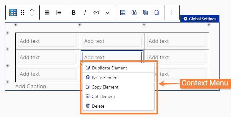
When you right click any cell within the table, you will get a context menu with the following settings:
- Duplicate Element: To create an exact copy of the selected element within the cell.
- Copy Element: To copy the selected element to the clipboard for pasting elsewhere.
- Cut Element: To remove the selected element from the cell and copy it to the clipboard.
- Paste Element: To insert the copied or cut element from the clipboard into the selected cell. (This option becomes visible only when you have copied or cut an element)
- Delete: To permanently remove the selected element from the cell.
Cell Selector #
When you right-click in the cell selector, you will get context menu with the following cell settings:
- Paste Element: To insert a previously copied or cut element into the selected cell. (This option is available only after copying or cutting an element.)
- Add Elements: To insert a new element into your selected cell.
- Delete Elements: To remove the selected element from the table.
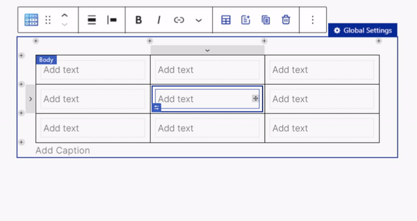
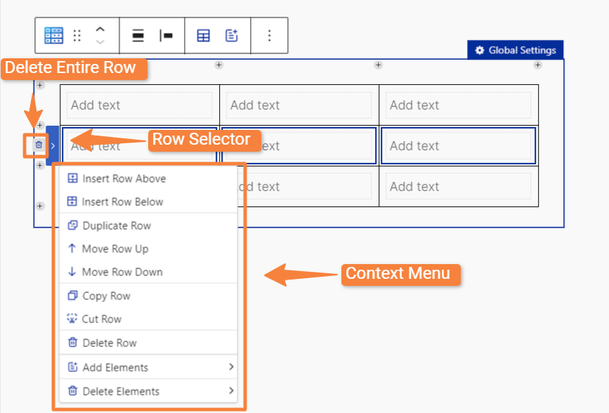
Row Selector #
When you hover over the left side of the table, you will see “Row Selector” to select the entire row. Once you select a row, “Delete” icon will be visible to remove the entire row.
Also, if you right-click the Row Selector, a context menu will appear with the following row settings:
- Insert Row Above/Below: To add a new row either above or below the selected row.
- Duplicate Row: To create a copy of the selected row, including its content.
- Move Row Up/Down: To reposition the selected row up or down within the table.
- Copy Row: To copy the selected row to the clipboard for pasting elsewhere.
- Cut Row: To remove the selected row from the table and copy it to the clipboard for pasting elsewhere.
- Delete Row: To remove the selected row from the table.
- Convert to Header Section: To change the selected row into a header row (only visible if a header hasn’t been set for the table).
- Add Elements: Allows you to insert new elements (like text, images, or buttons) into the selected row.
- Delete Elements:
- Delete All: To remove all elements from the selected row.
- Delete: If multiple elements are present in the selected row, a delete option will be available for each element.
Note: If you select the header row using the row selector, you may not see the same level of row settings in the context menu.
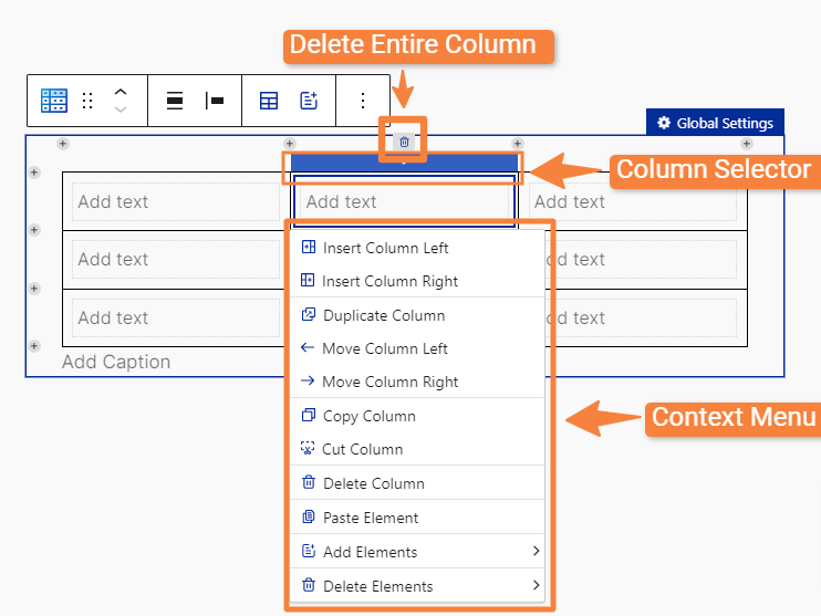
Column Selector #
When you hover over the top cell of any column, you will see the “Column Selector” option, which allows you to select the entire column. Above this selector, a “Delete” icon will appear, enabling you to remove the whole column with a single click.
By right-clicking on the Column Selector, you can access a context menu with the following column settings:
- Insert Column Left/Right: To add a new column either to the left or right of the selected column.
- Duplicate Column: To create a copy of the selected column, including its content.
- Move Column Left/Right: To reposition the selected column left or right within the table.
- Copy Column: To copy the selected column to the clipboard for pasting elsewhere.
- Cut Column: To remove the selected column from the table and copy it to the clipboard for pasting elsewhere.
- Delete Column: To remove the selected column from the table.
- Add Elements: To insert a new element (like text, images, or buttons) into the selected column or cell.
- Delete Elements:
- Delete All: Removes all elements from the selected column.
- Delete: If multiple elements in the selected column, a delete option will be available for each element.
+ (Plus) Row or Column Adding Facility #
After inserting the table, you will notice a “+” icon on the left side and above the table. The “+” icon on the left allows you to insert a new row, while the “+” icon above enables you to insert a new column.
Drag and Drop Function: #
You will see a drag icon within each cell inside the Table Builder block. By using the drag icon, you can easily rearrange any element within the table.
Add Caption #
Use this option to add a caption for your table.
4. Settings Panel #
In the settings panel, you will find three tabs: General, Style, and Advanced, which allow you to manage and customize your table.
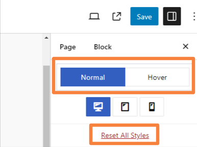
Above these tabs, you will see 3 exclusive options provided by RioVizual’s Table Builder block:
- Normal: To customize your table for devices like desktops, tablets, and smartphones.
- Hover: To apply hover effects to table elements.
- Reset All Styles: To reset all styles you have applied to your table.
General Tab #
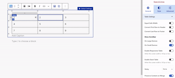
Initially, after inserting the block, you will only see “Table Settings” in the General tab. With in the table settings, you will get these options:
Table Settings: #
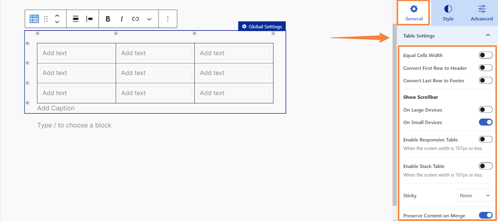
- Equal Cells Width: To set equal width for all table cells for a balanced layout.
- Convert First Row to Header: To convert the first row as a table header.
- Cover Last Row to Footer: To convert the last row into a footer
- Show Scrollbar:To add a horizontal scrollbar for large or small devices if table content exceeds the available space.
- Enable Responsive Table: Enable this to adjust the table’s layout to fit different screen sizes.
- Use top Row as Header: Enable this to convert the first row as header. (Visible only if no header is already set).
- Responsive Breakpoint: Set the screen width where the table becomes responsive.
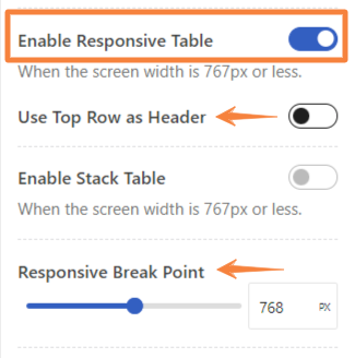
- Enable Stack Table: Turn on this option to arrange table rows vertically on smaller screens.
- Responsive Breakpoint: Sets the screen width at which the table should switch to its stacked layout.
Note: If you use the “Enable Responsive Table” option, then you cannot use the “Enable Stack Table”. Only one of the options can be enabled at a time.
- Sticky: Choose none, top row, or first column to keep the selected row or column fixed in place while scrolling.
- Top Row: To keep the first row fixed at the top of the table while you scroll through the rest of the content. (It won’t function on large screens with the scrollbar enabled or on small screens with the scrollbar, responsive table, or stacked table options active.) You can set the stick offset from top.
- First Column: To keep the first column fixed while scrolling horizontally. (It works only with scrollable tables and won’t function on small devices if the stack table option is enabled.) Adjust the sticky offset from left.
- Preserve Content On Merge: Toggle this option to keep cell data while merging multiple cells.
Content Settings #
After inserting the block, the “Content” tab won’t appear until you click on a cell within the table. When you select any element whether it’s text, an image, a list, or another type, you will see the relevant settings in the “Content.”
Here are the settings options for each of the six elements in the Table Builder block found in the General tab’s content:
Text:
When you click on table’s text element, you will get the following options under content:
- Text: To enter the text you want to display in the cell.
- Content Tag: To select a specific HTML tag to apply to the text
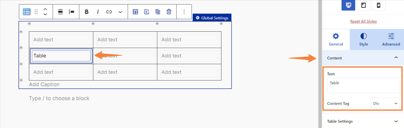
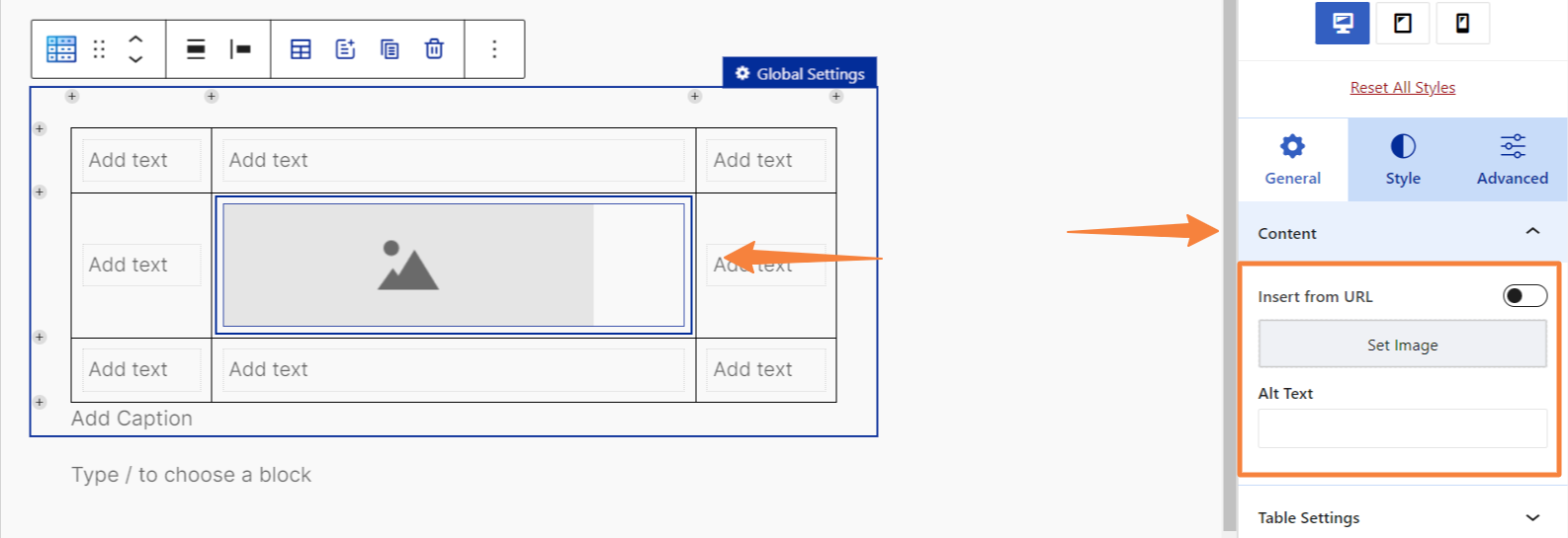
Image:
When you insert an image into the table, the following options will appear under “Content”:
- Insert from URL: To add an image by entering its URL.
- Set Image: To upload or select an image from your media library.
- Alt Text: To write down an alternative text for the image
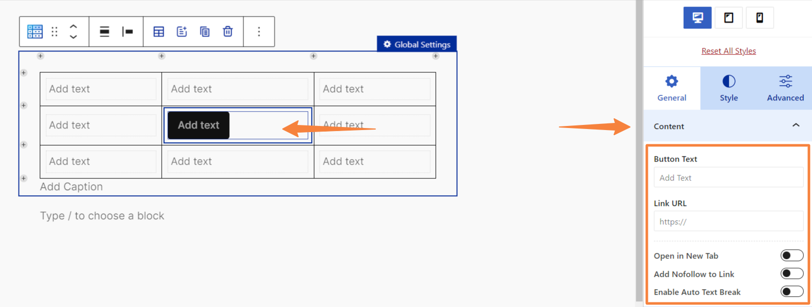
Button:
If you add a button element to the table, you will find the following options under “Content”:
- Button Text: To enter the text that will appear on the button.
- Link URL: To set the destination URL the button will link to.
- Open in New Tab: To choose whether the link opens in a new browser tab.
- Add Nofollow Link: To add a “nofollow” attribute to the link. (It indicates search engines should not follow it.)
- Enable Auto Text Break: To allow the button text to automatically break into multiple lines if it’s too long.
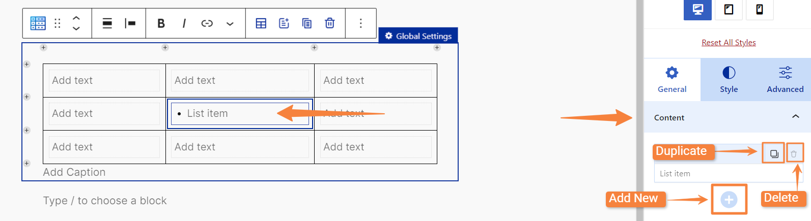
List:
When you add a list element to the table, you will see these options under “Content”:
- List Item: Edit, duplicate, or delete an existing list item.
- Add New: To add more items to the list.
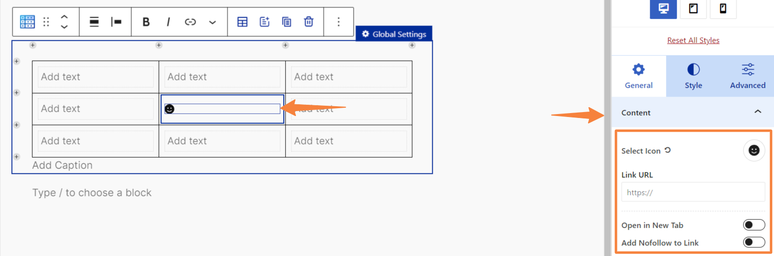
Icon:
After adding icon in the table, you will get these options in the “Content”:
- Select Icon: Choose an icon from a library (Font Awesome) of available icons.
- Link URL: Enter the URL that the icon will link to.
- Open in New Tab: Choose whether the link opens in a new tab.
- Add Nofollow to Link: Select this option to add a nofollow attribute to the link.
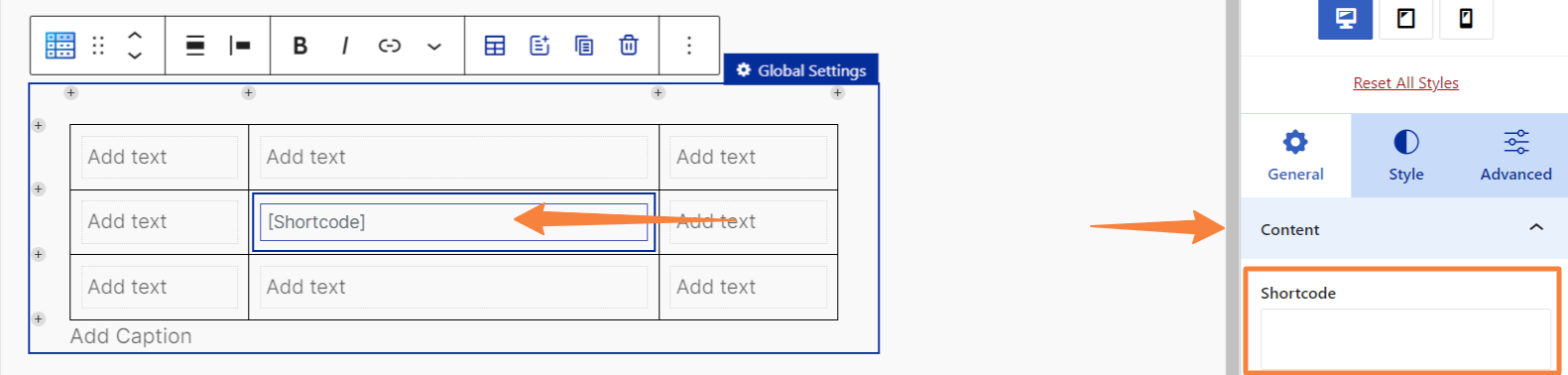
Shortcode:
If you add shortcode element in your table, you will see these options in the “Content”:
- Shortcode: To enter the shortcode code that you want to insert into the table.
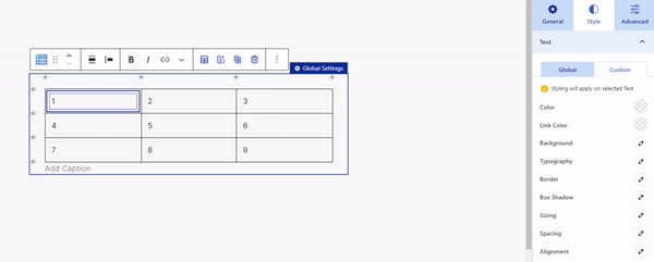
Style Tab #
If you click on the “Style” tab immediately after inserting the block, you will only see three settings options: text, cell, and table.
However, as you click on individual elements in the table, such as an image, button, or others, you will see the element-related settings appear in the “Style” tab.
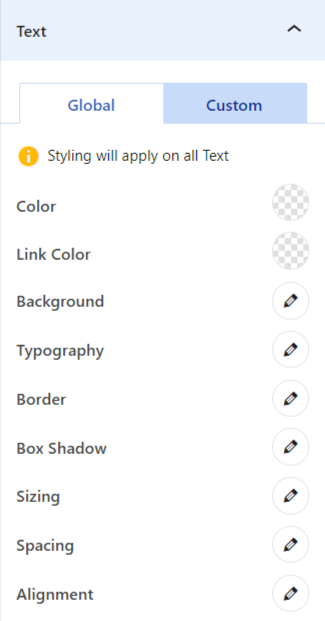
Moreover, inside each element’s settings, you will find two tabs: Global and Custom.
- Global: This option lets you apply a uniform style to an element throughout the table. For example, selecting a text color in the Global tab will apply it to all text in the table.
- Custom: This option lets you apply a specific style to an individual element..
Both the Global and Custom tabs will contain nearly the same customization settings. Now lets see what settings options you will get in the “Style” tab for each element in the table:
- Text: To customize text appearance using options like color, link color, background, typography, border, box shadow, sizing, and more.
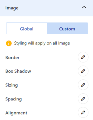
- Image: To style the image appearance with options for border, box shadow, sizing, spacing, and alignment.
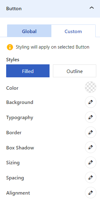
- Button: Choose a button style (filled or outline) and customize its appearance using options such as color, background, typography, border, box shadow, and more.
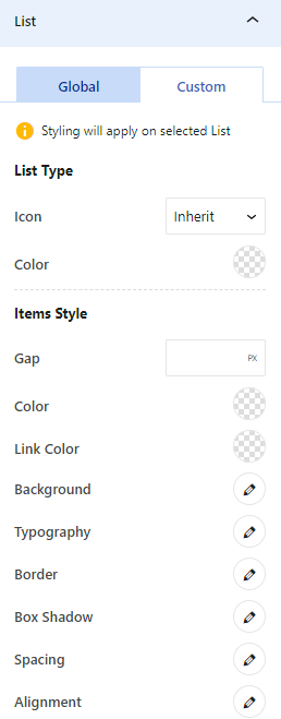
- List: Style the list using options like icon type, color, gap adjustment, link color, background, typography, border, box shadow, and additional settings.
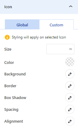
- Icon: To adjust icon size, icon color, background color, border style, and more for individual icons.
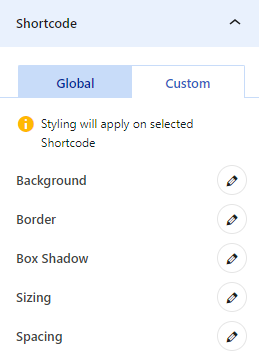
- Shortcode: To style the shortcode content using options like background color, border, box shadow, and other relevant settings.
- Cell: Select between collapse or separate cell border types, and modify background, border, spacing, and additional settings.
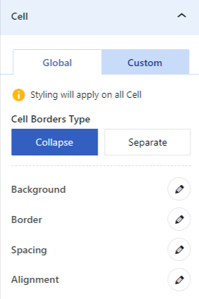
Note: “Collapse” and “Separate” will only be available in the Global tab.
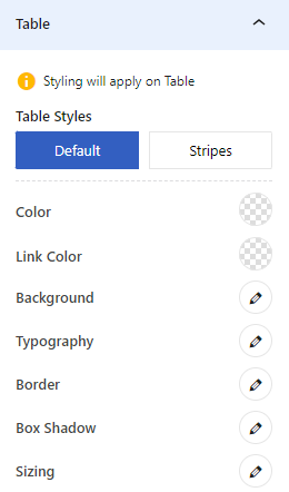
- Table: Choose between default or striped table styles, and customize the table further with settings for color, link color, background, typography, and more.
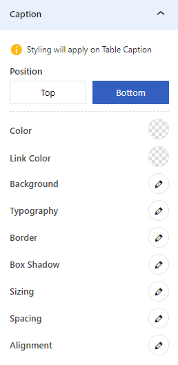
- Caption: Adjust the caption’s position (top or bottom) and style it using options like color, link color, typography, sizing, and additional settings.
Note: When you select the “Global Settings” and navigate to the “Style” tab, you will find element-related settings in the “Global” tab, with no settings in the “Custom” tab. This happens because enabling global settings puts the table in a global state, disabling custom options.
Select and Style Multiple Elements #
You can select and style multiple elements together at the Table Builder block. For that, you can follow two different approaches:
- Hold Ctrl and Select: To select multiple elements, press and hold the Ctrl key while clicking on each element. Then, go to the Style tab to apply your desired styling to the selected elements.
- Hold Shift and Select: Click on the first element, then hold the Shift key and click on the last element in a sequence to select all elements in between. Next, go to the Style tab to apply your desired styles to the selected elements.
Advanced Tab #
After inserting the table, if you navigate to the “Advanced” tab, you’ll see an option for adding “Additional CSS Class(ES) of Table.”
But, when you click anywhere inside the table, more settings options will appear under the Advanced tab, such as:
- Plus Extra: Cell
- Cell Tag:
- Advanced:
- Additional CSS Class(ES) of selected Element
- Additional CSS Class(ES) of selected Cell
- Additional CSS Class(ES) of Table
Need More Help? #
If you have any questions, contact our support team at [email protected]


