Pros and Cons block lets you create diverse types of pros and cons tables within WordPress. To make the table look more engaging, you can add icons to header and body items.
You will also get 6 free premade templates to kickstart your project. In this guide, we will delve into all the features and functions of the Pros and Cons block.
Adding the Pros and Cons Block #
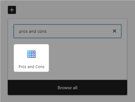
- Go to the page/post where you want to add the table.
- Click the “+” button, search for “Pros and Cons” and insert it.
- Next, choose from two table creation options:
- Template: Hover over any template to insert it. Once inserted, you can easily edit the content to suit your needs.
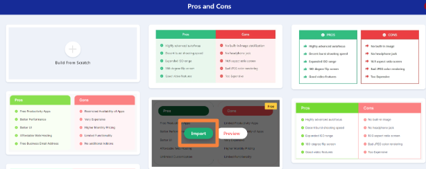
- Build From Scratch: Choose this option to create a table from scratch.
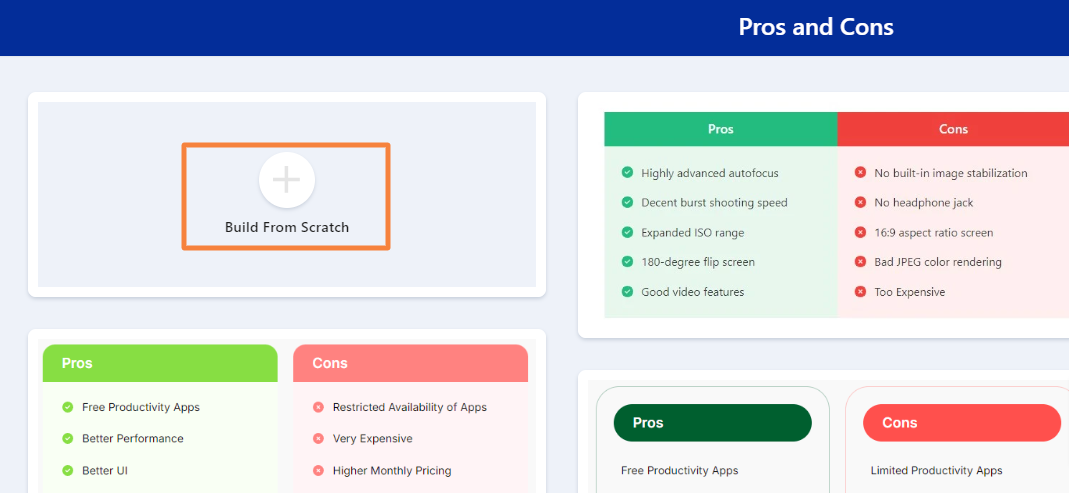
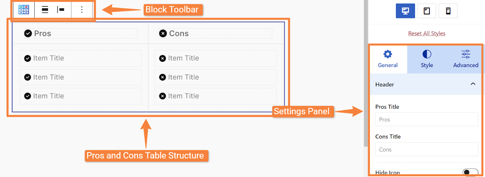
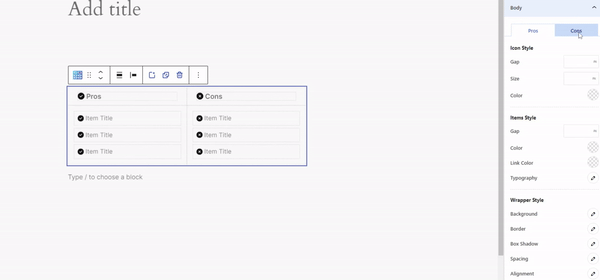
After inserting the block, you will see these:
- Block toolbar
- Pros and cons table structure
- Settings panel on the right side
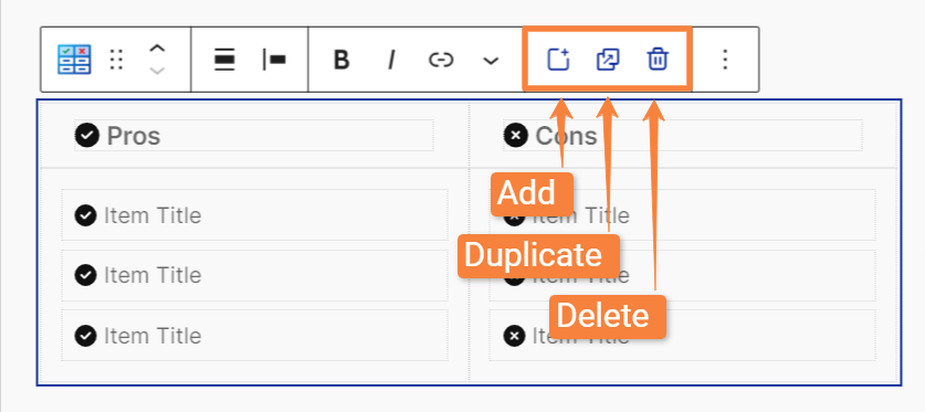
1. Block toolbar #
The toolbar includes various default Gutenberg settings along with 3 additional options offered by this block. They are:
- Add: To insert a new column directly beneath your selected cell.
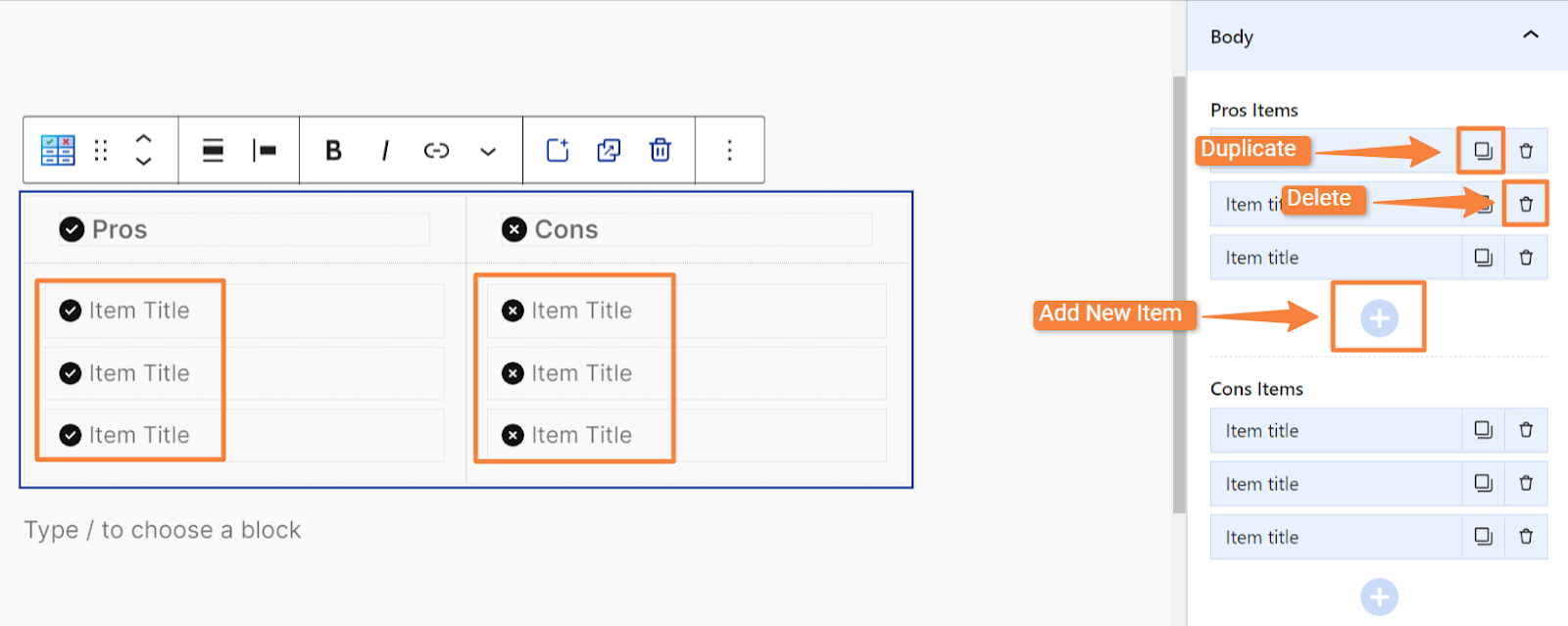
- Duplicate: To create a duplicate copy of the selected cell. (If the cell contains content, the duplicated copy will keep that content.)
- Delete: To remove the selected cell from the table.
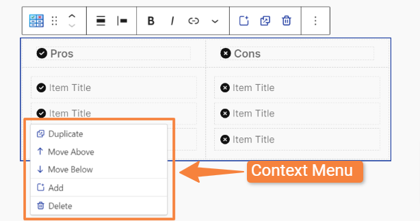
2. Pros and Cons Table Structure #
The initial table structure will have two columns and several rows filled with placeholder text. You can easily edit the text in any cell by clicking on it.

However, when you right-click any element inside the table, a context menu will appear with these settings:
- Duplicate: To create a copy of the selected cell (with content) below the original.
- Move Above/Below: To the selected cell one position up or down from its current position.
- Add: To insert a new cell directly beneath the selected cell.
- Delete: To remove the selected cell from the table.
Settings Panel #
The Pros and Cons block’s settings panel offers all necessary settings options in three tabs: General, Style, and Advanced.
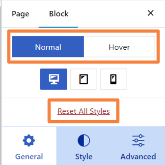
However, in the settings panel, you will also find three unique settings exclusive to RioVizual’s Pros and Cons block:
- Normal: To customize your pros and cons table for specific devices, such as desktops, tablets, and smartphones.
- Hover: To apply hover-style effects to table elements to enhance interactivity.
- Reset All Styles: To quickly reset all styles you have applied to your pros and cons table.
Now let’s explore all the available settings in each tab:
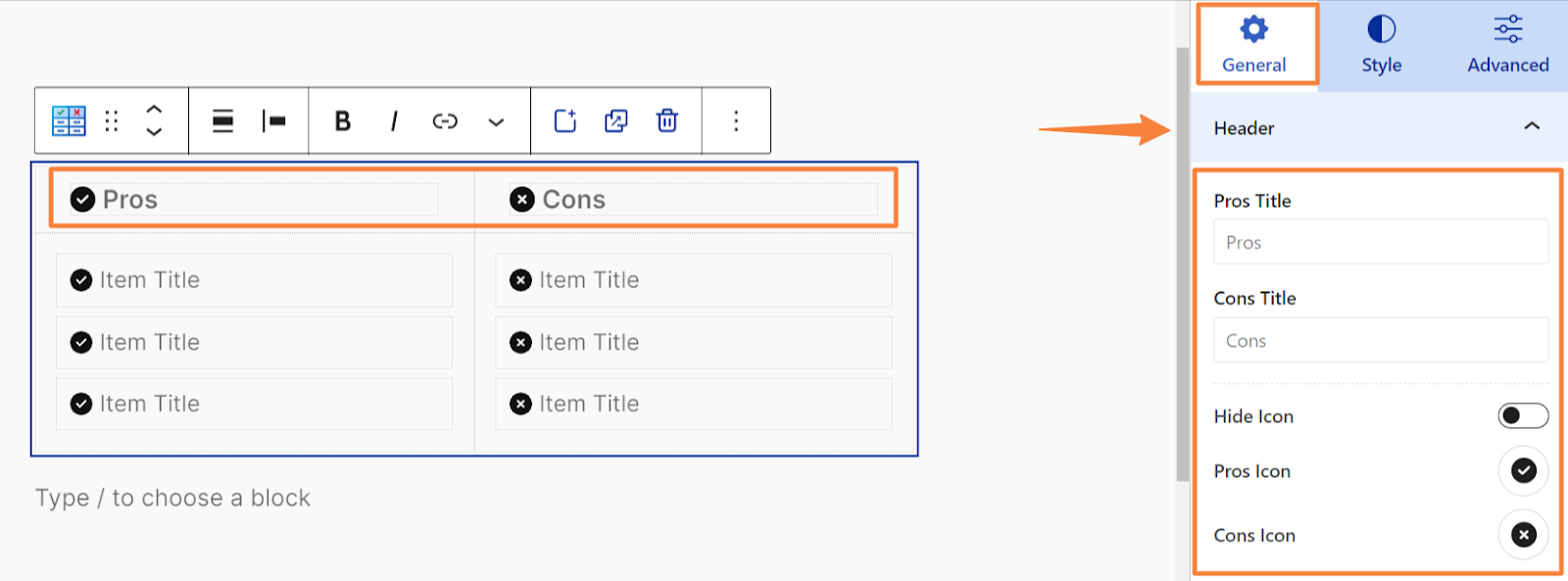
General Tab #
The General tab houses all the basic settings for your Pros and Cons block. These settings include:
Header #
- Pros Title: To set the title for the Pros section.
- Cons Title: To set the title for the Cons section.
- Hide Icon: Toggle on to hide the icons next to the titles.
- Pros/Cons Icon: Choose an icon (FontAwesome) for the “Pros” and “Cons” sections.
Body #
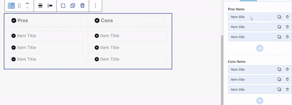
- Pros Items: Add, edit, duplicate or delete the items listed under the “Pros” header
- Cons Items: Add, edit, duplicate or delete the items listed under the “Cons” header.
- Hide Icon: Toggle this option on to hide the icon associated with the items.
- Pros/Cons Icon: Choose an icon (FontAwesome) for the “Pros” and “Cons” items.
Note: Click on any “Items Title” to edit or add your desired text. You can also use drag-and-drop functionality to rearrange items and change their order.
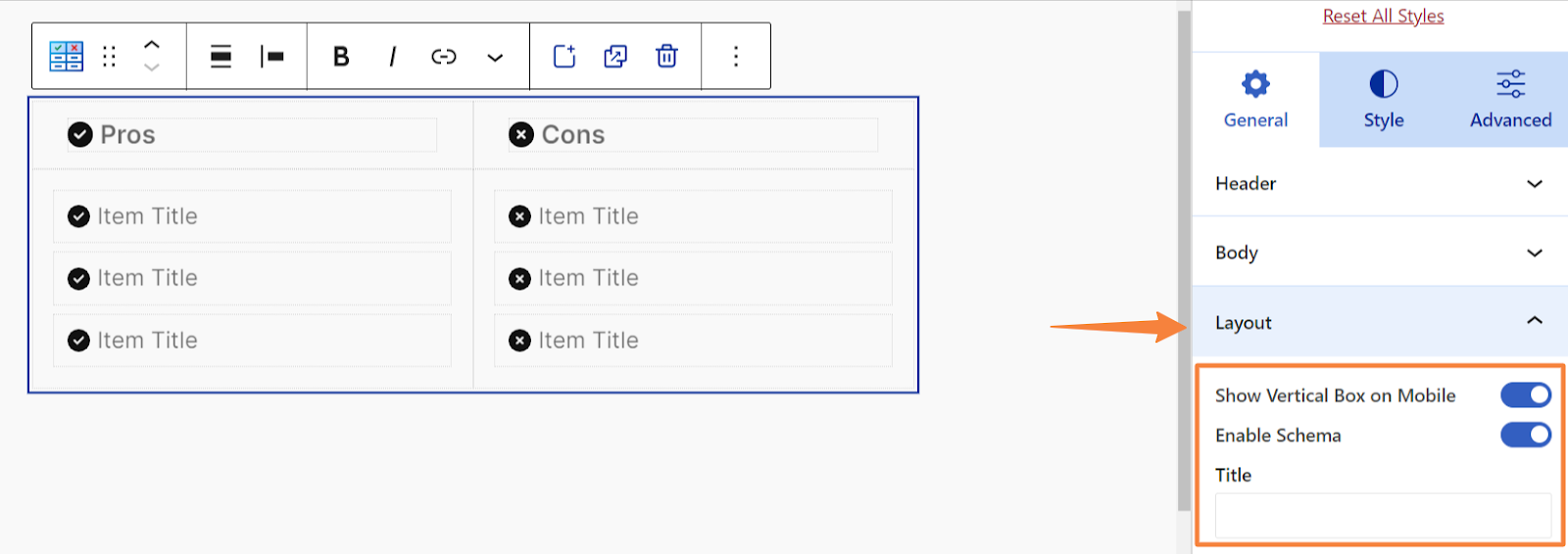
Layout #
- Show Vertical Box on Mobile: Toggle this option on to display the items in a vertical layout on mobile devices.
- Enable Schema: Toggle this option on to implement schema markup, enhancing search engine visibility and rich snippets.
- Title: Specify the title for the layout, which will be prominently displayed to users.
Style Tab #
The “Style” tab provides all the styling options for RioVizual’s Pros and Cons block. Let’s explore them:
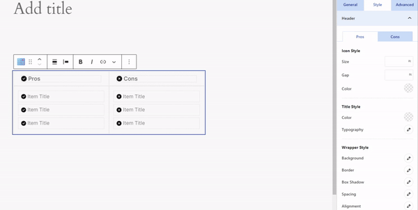
Header #
When you click on the “Header,” you will see two sub-tabs: Pros and Cons. Within each tab, you can individually set the following styling options for the Pros and Cons headers:
- Icon Style:
- Size: Adjust the header icon size.
- Gap: Set the gap between the header icon and the header title.
- Color: Choose the color for the header icon.
- Title Style:
- Color: Choose the text color for the header title.
- Typography: Set the font size, font weight, font family, and text alignment and more for the header title.
- Wrapper Style:
- Background: Choose the background color for the header wrapper (the container that holds the title and icon).
- Border: Customize the border style, color, and width for the header wrapper.
- Box Shadow: Add a box shadow to the header wrapper.
- Spacing: Set the padding around the header wrapper.
- Alignment: Set the alignment of the header wrapper within the table.
Body #
Similar to the Header, the Body option also features Pros and Cons tabs, allowing you to individually style the items in each section of the table.
- Icon Style
- Gap: Adjust the spacing between the icon and the text.
- Size: Set the size of the icon.
- Color: Choose a color of the icon to match your design.
- Items Style
- Gap: Adjust the spacing between individual items for better layout control.
- Color: Choose a color for the item text.
- Link Color: Choose a color for any links that are included in the item text.
- Typography: Set the font size, font weight, font family, text alignment and more for the item text.
- Wrapper Style
- Background: Choose the background color for the table body wrapper.
- Border: Customize the border style, color, width, and radius for the table body wrapper.
- Box Shadow: Add a box shadow to the table body wrapper.
- Spacing: Set the padding around the table body wrapper.
- Alignment: Set the horizontal and vertical alignment of the table body wrapper within the table.
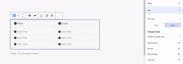
Box #
Within this option, you can adjust the Box Gap, which sets the spacing between the Pros and Cons boxes.
After this option, you will see Pros and Cons tabs to separately style each box with the following options:
- Hader & Body Gap: Set the spacing between the header and body items.
- Background: Apply a background color to the box. (Header and body items)
- Border: Define the border style, width, color and radius for the box.
- Box Shadow: Add a shadow effect to the box.
- Spacing: Adjust the padding around the box.
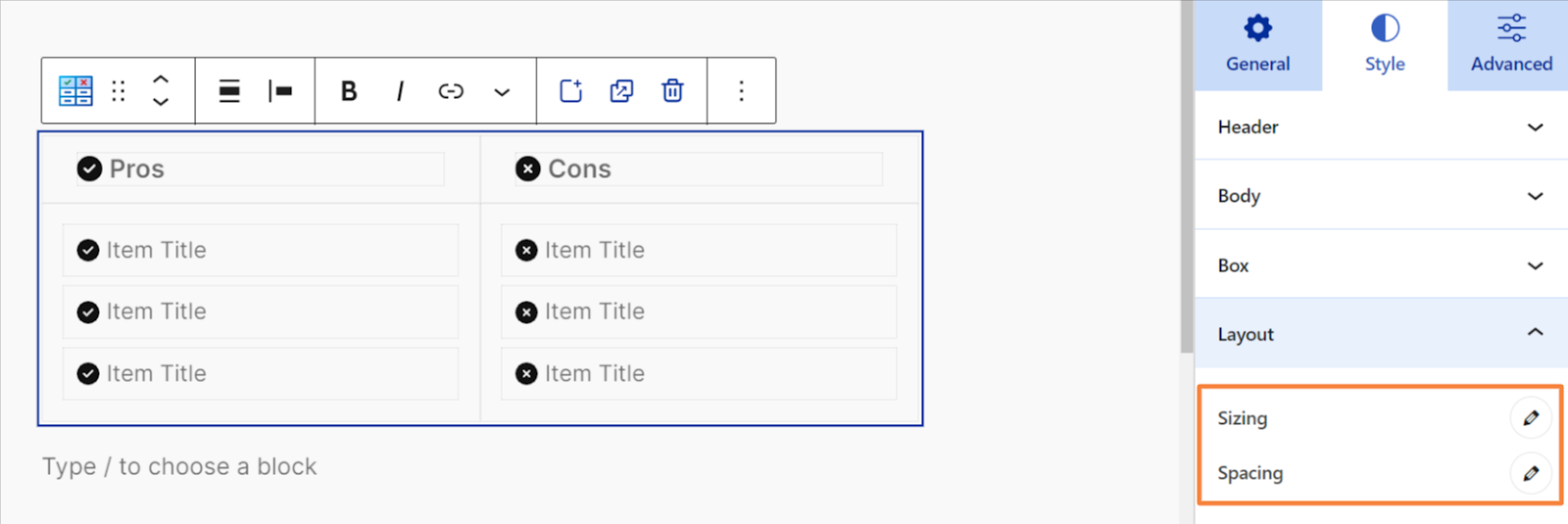
Layout #
- Sizing: To adjust table container’s width, max width and min width.
- Spacing: To adjust the table container’s padding.
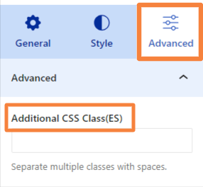
Advanced Tab #
To achieve a higher level of design or customization, explore the “Additional CSS Class (ES)” option in the Advanced tab.
Need More Help? #
If you have any questions, contact our support team at [email protected]


