Pricing Table block lets you create pricing tables with elements like title, price, feature, and button. You can create various types of pricing tables with multiple columns to display different pricing plans.
This block also offers a wide range of customization options with both global and custom styling flexibility. More than that, it includes a right-click table management feature and 19 free pre-made templates.
In this documentation, we will cover everything, including detailed information about each element and their specific capabilities.
Adding the Pricing Table Block #
- Open the post or page in your WordPress editor where you want to include a pricing table.
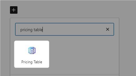
- Click the “+” button, search for “Pricing Table,” and insert it.
- Choose “Build From Scratch” or start with one of the free pre-made templates. To use a template, hover over any template and click “Import.”
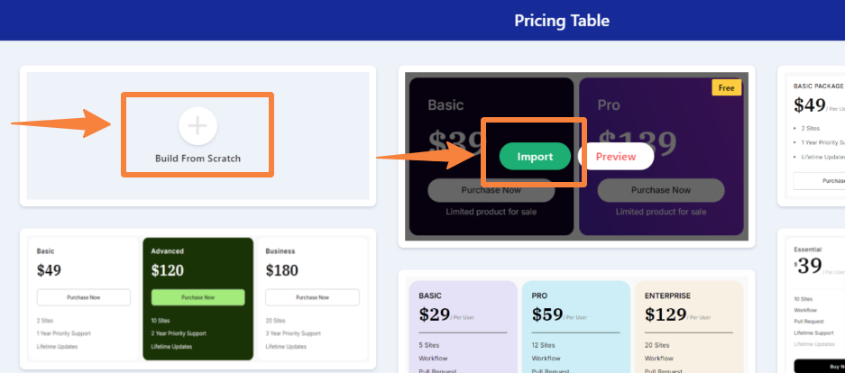
We are going to choose the Build From Scratch option. After inserting the block, you will see the following options:
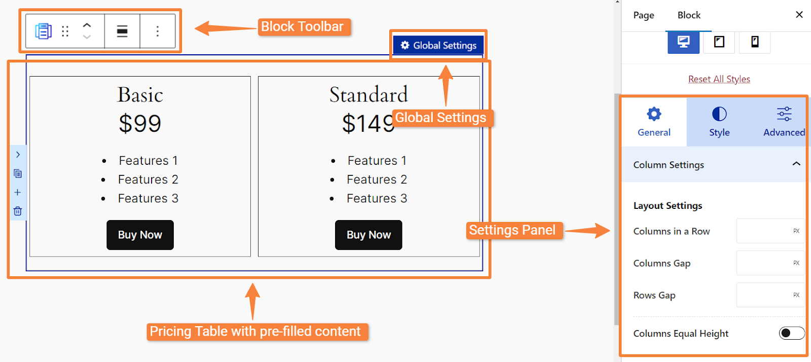
- Block Toolbar
- Global Settings
- Pricing Table with pre-filled content
- Settings Panel
1. Block Toolbar #
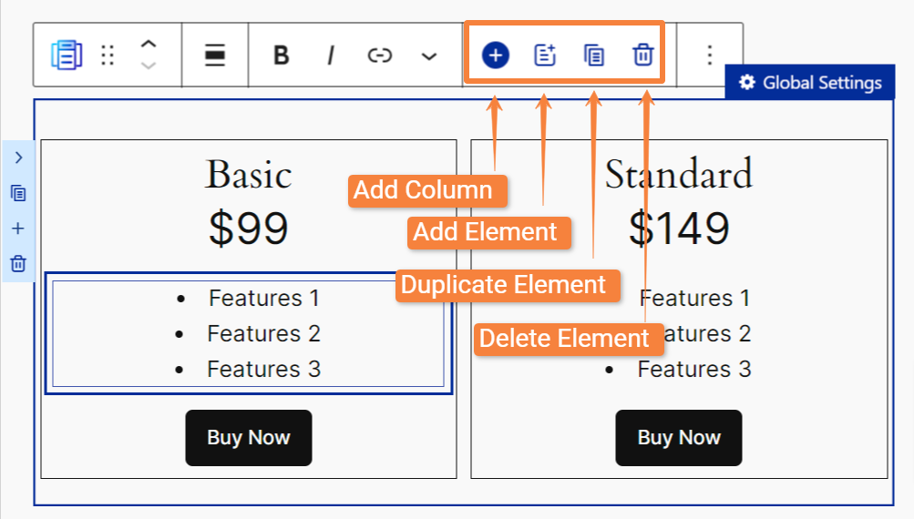
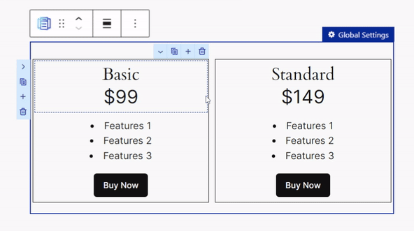
In the toolbar, you will find some default options along with 4 unique options specifically offered by the Pricing Table block:
- Add Column: To create an exact copy of your selected column without its content.
- Add Element: Use this option to add a new element below the currently selected element. If your table cell is empty, the new element can be placed directly within the cell.
- Duplicate Element: To create an exact copy of your selected element.
- Delete Element: To delete any selected element from the table.
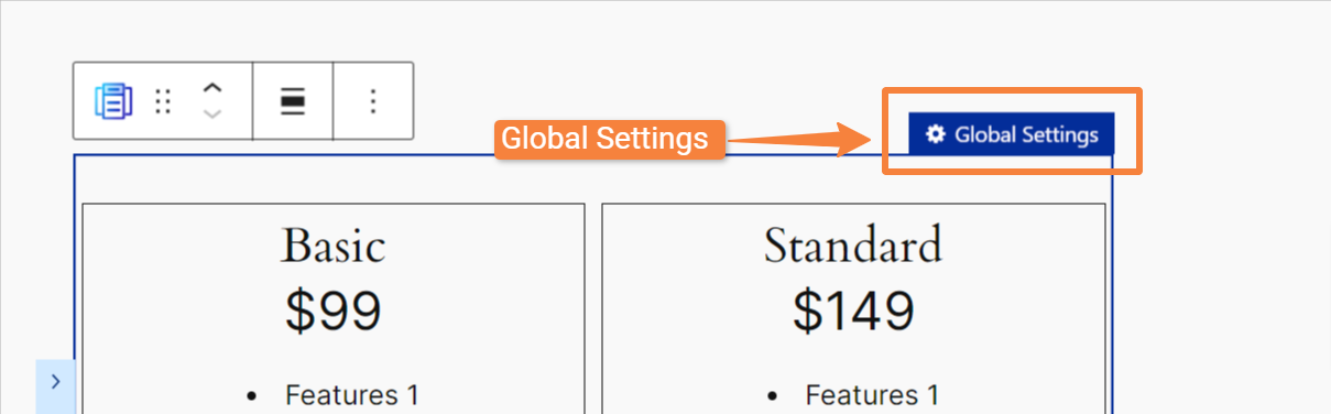
2. Global Settings #
When you click on the “Global Settings” option, the table enters a global state. That means in the settings panel, you will see global settings that you can apply to the entire table.
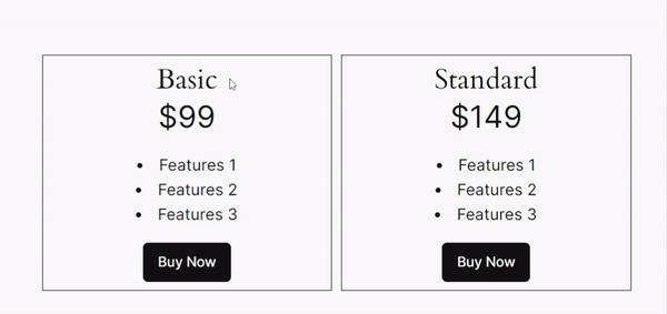
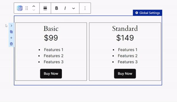
3. Pricing Table with Pre-filled Content #
After inserting the block, you will see a pricing table with two columns and a couple of rows with pre-filled content. Simply click on any cell to change its content.
In addition to editing the content, you can also perform a variety of other actions to further customize the pricing table. Such as:
Right Click Menu #
When you right-click any cell, you will see a context menu with range of settings options include:
- Add Element: Insert a new element below the currently selected cell. (If the cell is empty, the new element will be added directly in its place.)
- Duplicate Element: To create an exact copy of the selected element.
- Move Element Before/After: Move the selected element above or below the current one.
- Delete Element: Remove the selected element from the table.
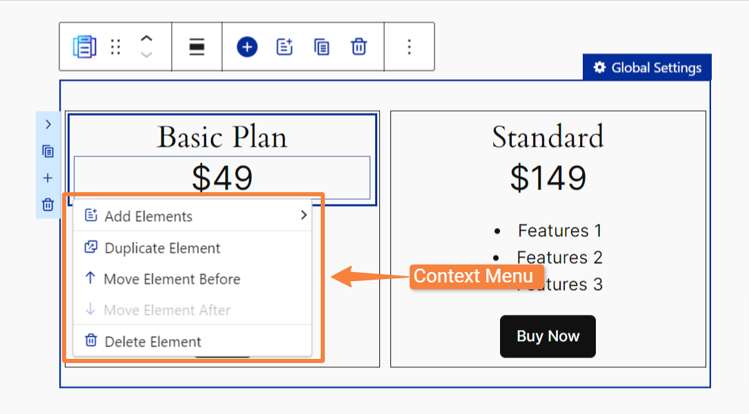
Note: Some options within the right-click menu may become active or inactive depending on certain conditions.
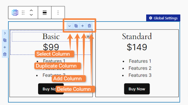
Individual Column and Row Settings #
To make things easier, RioVizual includes specific column and row settings options, which you can access by hovering over any column or row.
If you hover over a column, you will see options like:
- Select Column: To select an entire column for further customization or management.
- Duplicate Column: To make a duplicate copy of your selected column.
- Add Column: To add a new column beside your selected column.
- Delete Column: To delete your selected column.
On the left side of the pricing table, you’ll see settings for rows. These options are similar to the column settings but are specifically for rows.
- Select Row
- Duplicate Row
- Add Row
- Delete Row
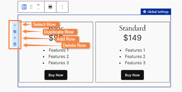
Note: Any modifications made in the row settings will automatically apply to all side-by-side columns.
Drag and Drop Facility #
The drag-and-drop feature allows you to easily rearrange elements within cells or move them between different cells.
4. Settings Panel #
In the settings panel, you will see three tabs: General, Style, and Advanced to manage and customize the pricing table.
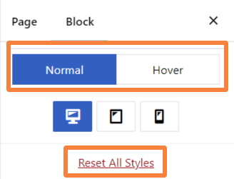
However, in the settings panel, you will also find three unique settings:
- Normal: It’s a responsive option that allows you to customize your table specifically for different devices, such as desktops, tablets, and mobiles.
- Hover: This feature allows you to apply a hover style for all table elements.
- Reset All Styles: If you click this button, it will reset all the applied designs.
General Tab #
When you first insert the Pricing Table block, you will only see “Column Settings” options in the General tab:
Column Settings #
- Column in a Row: Determine the number of columns in a row you want in your pricing table.
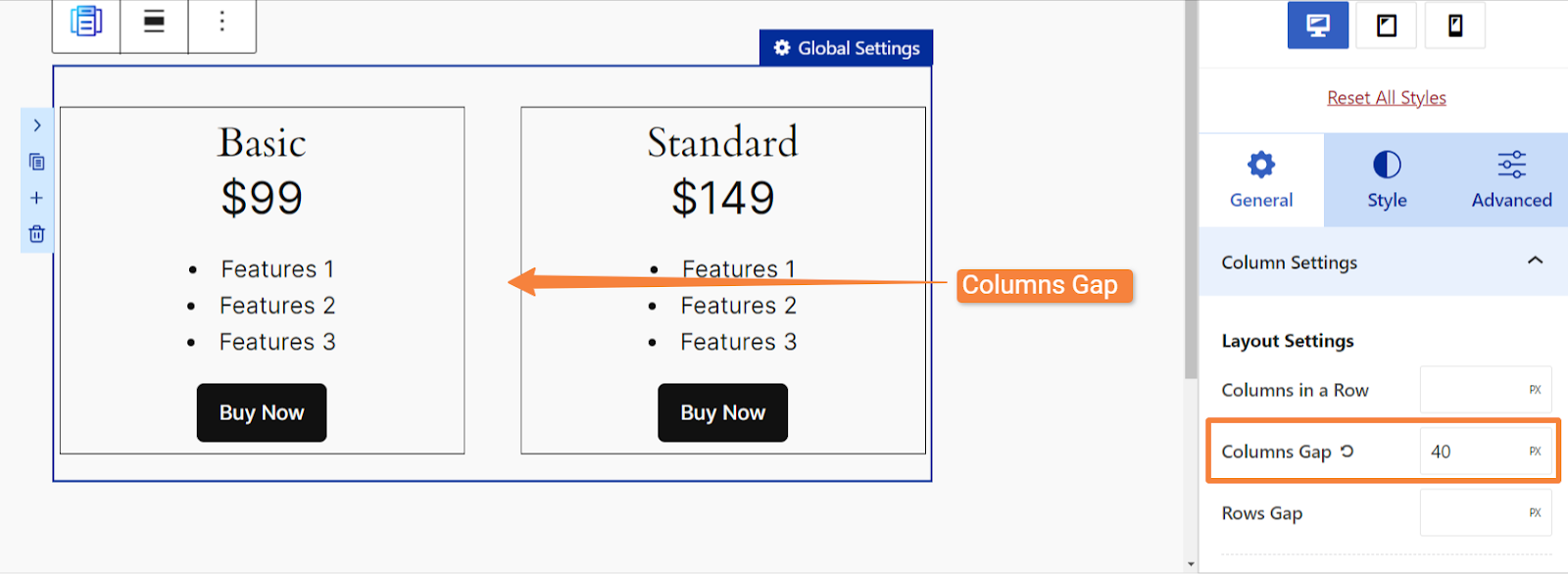
- Columns Gap: Set a gap between columns.
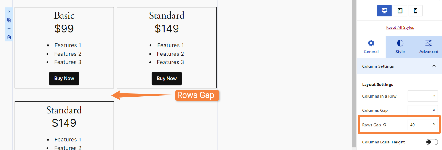
- Rows Gap: Set a gap between rows. (This is useful when you have multiple pricing plans vertically)
- Columns Equal Height: Toggle this on to make all columns the same height, regardless of the number of elements.
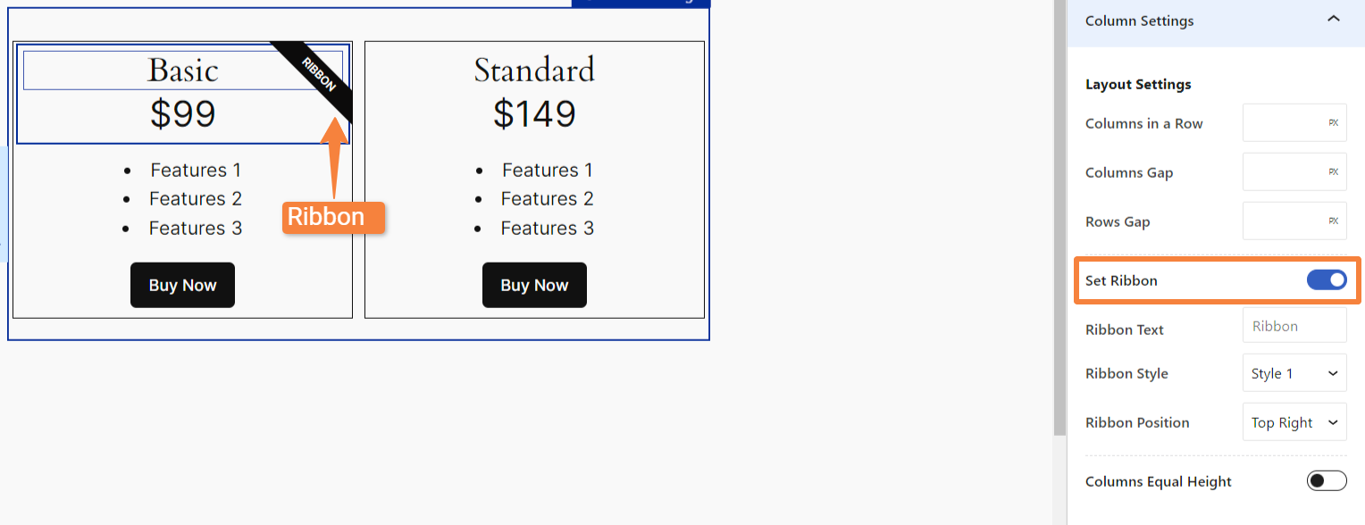
- Set Ribbon: Add a ribbon to your selected column. (This option appears only when you click inside a cell of the pricing table).
- Ribbon Text: Add a custom label to the ribbon.
- Ribbon Style: Choose from two styles
- Ribbon Position: Place the ribbon in the top right or top left corner.
Content #
When you click on an element in the table, you will see that specific element related in the Content. For example, clicking on a title will display title-related settings.
This applies to all elements, like price, feature list, and button. Let’s see the settings available for each element:
Title
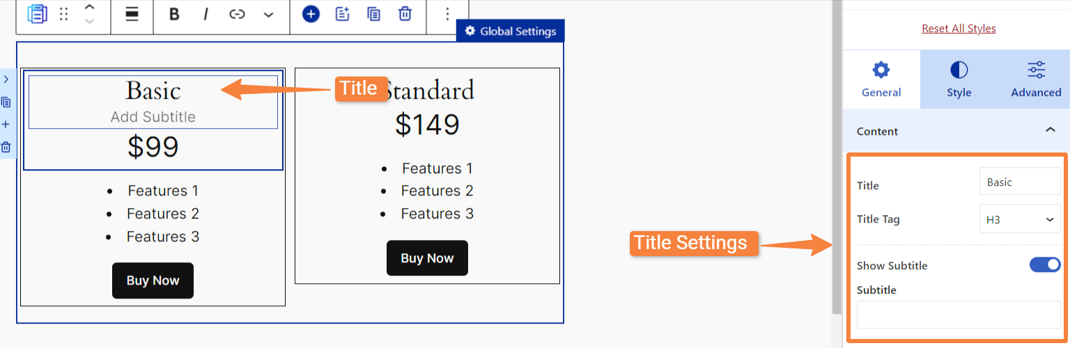
If you click on the “Title” in the pricing table, you will get these settings:
- Title: Enter your title text.
- Title Tag: Select your tag from various options.
- Show Subtitle: Toggle this on to display a subtitle under the title.
- Subtitle: To write down your subtitle text.
Price
Next, if you click on the “Price“, you will get these options:
- Currency: Input your currency symbol. (By default, you will see a dollar symbol)
- Currency Placement: Choose the placement of the currency symbol (left or right).
- Price: Enter the price amount.
- Period: Write down the pricing period, such as year, month, etc.

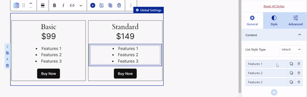
Features
Clicking on “Features”, you will these options:
- List Style Type: You can choose from 5 different styles to your feature list.
- Feature List: Add, edit, duplicate or delete feature list item.
- Text Opacity: To make the feature’s text partially transparent.
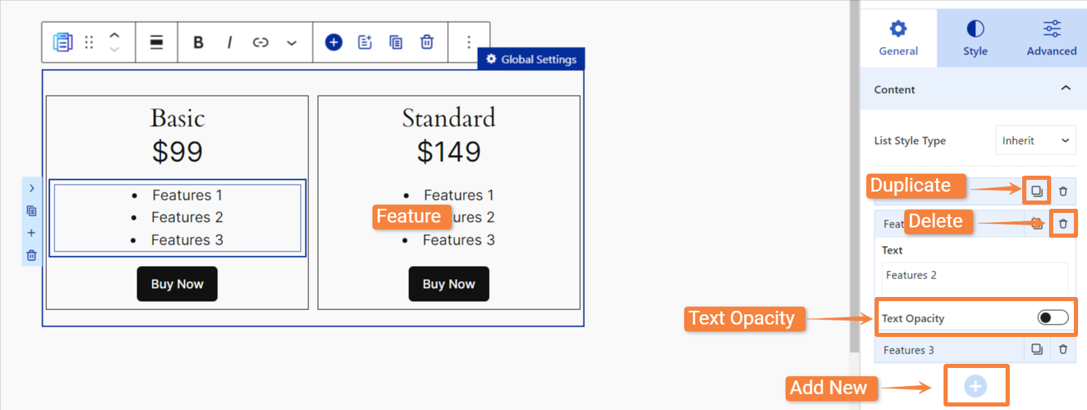
Note: Click on any features to add your desired text. You can also use drag-and-drop functionality to rearrange items and change their order.
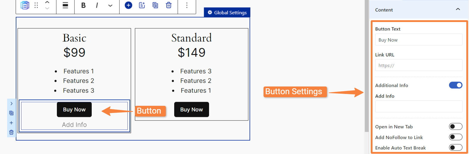
Button
For the “Button”, you will see these options:
- Button Text: Enter the text you want to display on the button.
- Link URL: Specify the URL where the button will link to when clicked.
- Additional Info: Enable this to add any additional information just below the button.
- Add Info: To add text for additional info.
- Open in New Tab: Make the link open in a new browser tab when clicked.
- Add NoFollow Link: Enable this to discourage search engines from indexing the linked page.
- Enable Auto Text Break: To automatically break long text into multiple lines.
 #
#
Style Tab #
Upon inserting the block, you will find styling options for all elements of the pricing table under the “Style” tab.
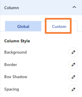
When you click on individual elements, you will find two tabs: Global and Custom.
- Global: This option lets you apply a uniform style to an element throughout the table. For example, setting a title background color in the Global tab will apply it to all title backgrounds in the table.
- Custom: Allows you to style individual elements separately, giving you control over specific items.
Both Global and Custom tabs contains nearly the same customization settings, such as:
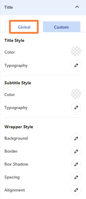
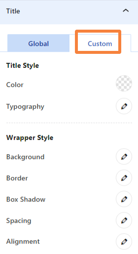
Title #
- Title Style: To change title text color and typography. Inside the typography option, you will find a variety of font styles and settings.
- Subtitle Style: To change subtitle title text color and adjust typography. (Only available in the Global tab)
- Wrapper Style: Customize the title container’s appearance by adjusting its background, border, alignment, shadow, and more.
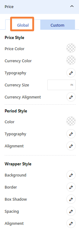
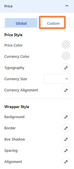
Price #
- Price Style: To customize the color of the price text, currency symbol, typography, size, and alignment.
- Period Style: To adjust the color, typography, and alignment of the period text. (Available only in the Global tab)
- Wrapper Style: To modify the background, border, box shadow, spacing, and alignment of the pricing container.
Features #
- Items Gap: To set the gap between feature items.
- Items Color: To change the color of the feature items.
- List Type Color: To change the color of the list type markers.
- Typography: To customize the typography of the feature items, including font family, size, weight, etc.
- Spacing: To adjust the top, right, bottom, and left margins of feature items.
- Alignment: To set the alignment of feature items within the list.
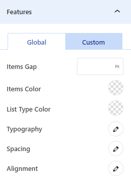
Note: Features offer the same styling options for Global and Custom.
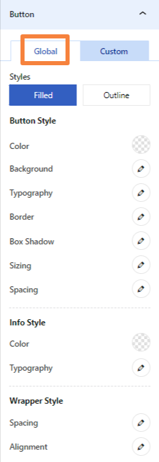
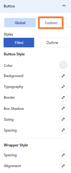
Button #
- Styles: Choose from filled or outline button style
- Button Style: To adjust the button’s text color, background color, typography, border, box shadow, and more.
- Info Style: To customize the color and typography of the info associated with the button. (Available only in the Global tab)
- Wrapper Style: To modify the spacing and alignment of the button’s container.
Cell #
- Background: To change the cell’s background color.
- Spacing: To adjust the cell’s top, right, bottom, and left padding and margins.
- Alignment: To modify the vertical alignment of the cell content.
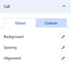
Note: Cell has the same styling options for Global and Custom.
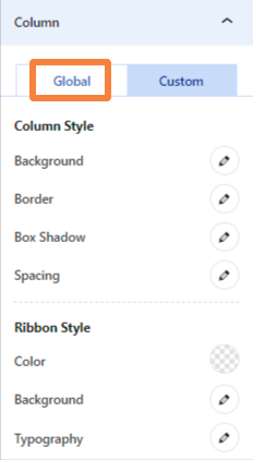
Column #
- Column Style: To customize column’s background color, border style, spacing, and more.
- Ribbon Style: To adjust the ribbon’s text color, background color, and typography. (Available only in the Global tab)
Advanced Tab #
After inserting the block, if you click on the “Advanced” tab, you will only see “Additional CSS Class(ES) of Pricing Table.” This will let you add custom CSS classes to the entire pricing table.
But as you click on any element in the table, you will see these options:
- Additional CSS Class (ES) of Selected Element: To add custom CSS classes to your selected element within the pricing table.
- Additional CSS Class (ES) of Selected Cell: To add custom CSS classes to your selected cell within the pricing table.
Need More Help? #
If you have any questions, contact our support team at [email protected].


