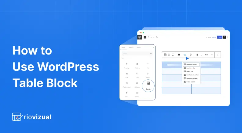
The WordPress Table Block helps you organize content in a clear and structured format using rows and columns.
To create a table, insert the Table Block, choose the number of rows and columns, add your content such as text or images, and style it to match your website design.
It is simple to use, even for beginners.
In this guide, you will learn how to use the WordPress table block and add it to any post or page, insert content inside cells, and use the available settings for customization.
Let’s start by adding the Table Block.
Step 1: Add the Table Block to any Post or Page
- Open your post or page in the Gutenberg editor.
- Click the “+” icon to add a new block.
- Search for the “Table” block and click to insert it.
- Define the number of rows and columns.
- Click “Create Table.”
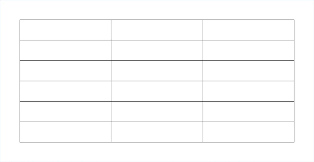
A blank table will be created based on your selected structure.
However, you can always add or remove rows and columns as your table design evolves.
Step 2: Understand the Block Toolbar
After creating the table, you will see a block toolbar at the top of the table. This toolbar allows you to perform quick actions without opening the settings panel. Such as:
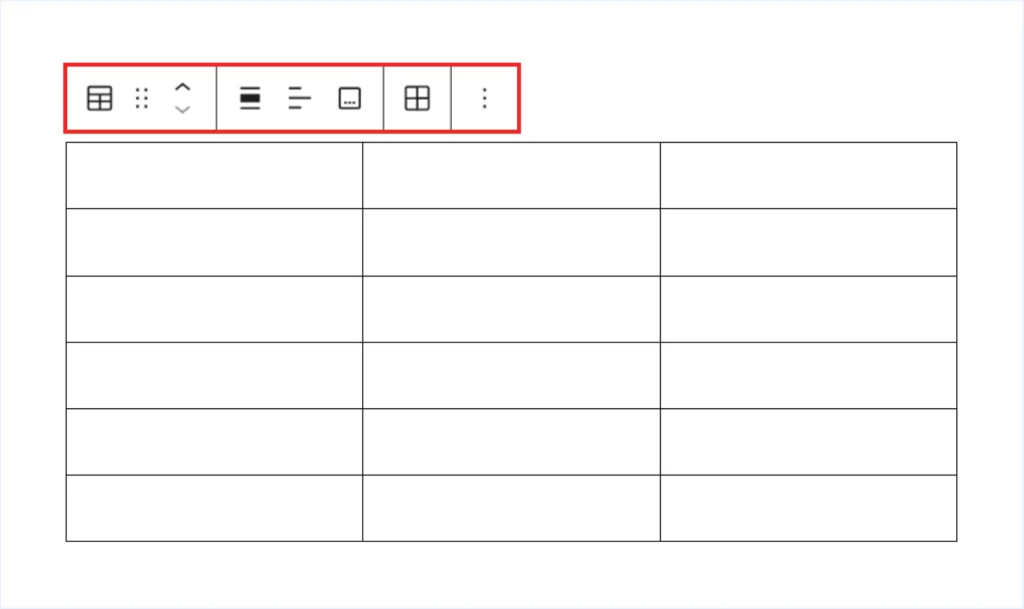
- Table (Block Transform Options): Selecting the Table icon from the toolbar reveals the following options:
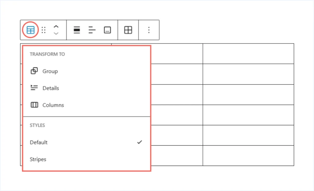
- Columns: Place the table inside a Columns layout block. This does not change the number of table columns. Instead, it lets you position the table beside another block.
- Details: Wrap the table inside a collapsible dropdown section. This is useful when you want to hide large tables by default.
- Group: Add the table into a Group block. This allows you to control spacing, background, and alignment together with other blocks. You can also transform the layout into a grid if needed.
- Styles: Select “Stripes” to apply alternate colors to odd and even rows. This improves readability for longer tables.
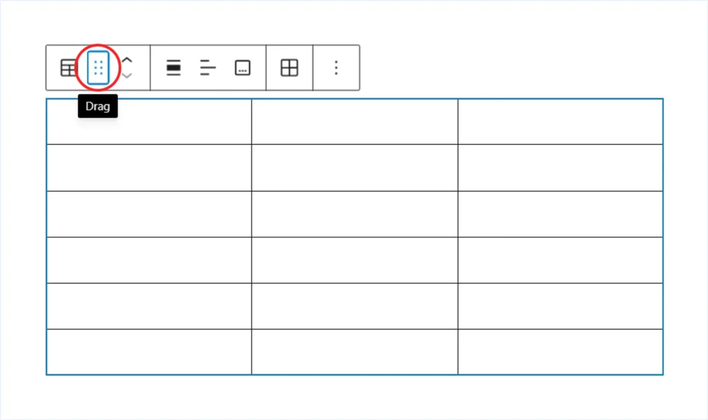
- Drag Handle: Drag and reposition the table before or after other blocks.
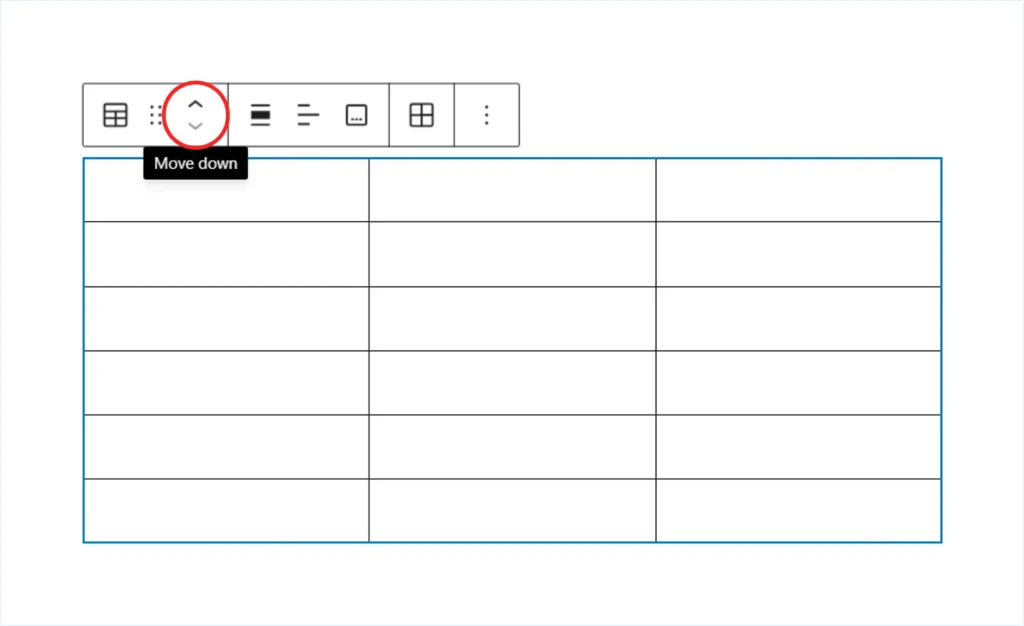
- Move Up / Down: Move the table block one position up or down within your content from its current location.
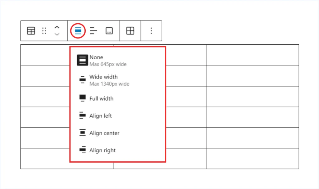
- Block Alignment: Align the table horizontally left, center, or right within the available space. Some themes also support Wide Width and Full Width alignment options.
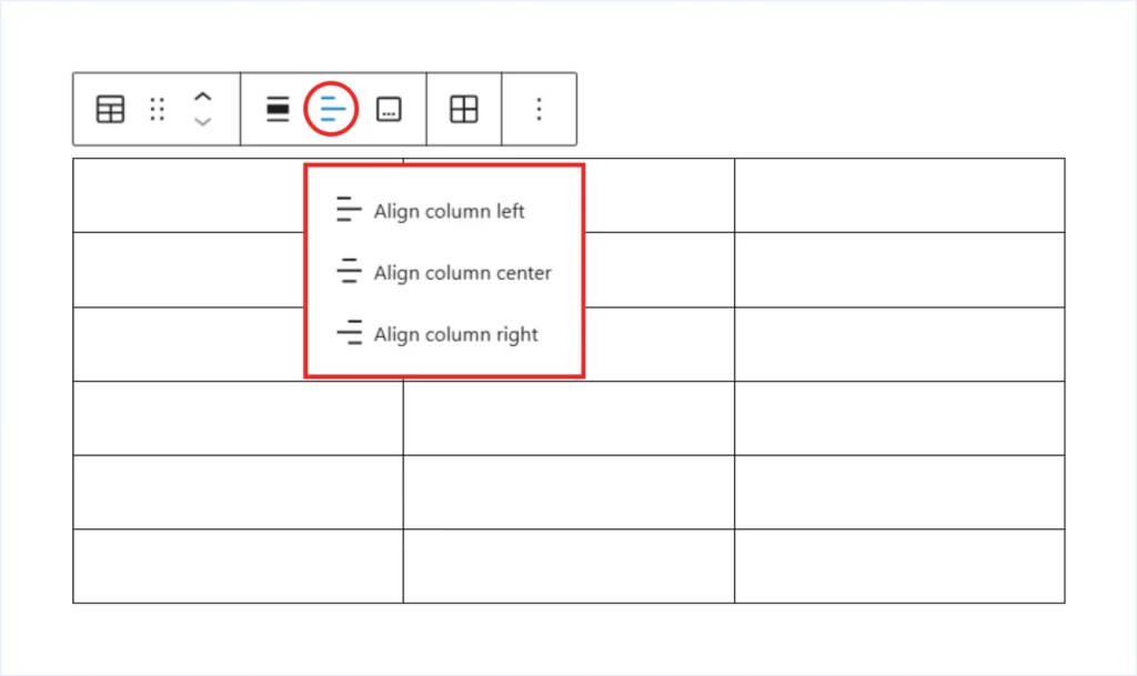
- Column Alignment: Align the content of a selected column horizontally, such as left, center, or right.
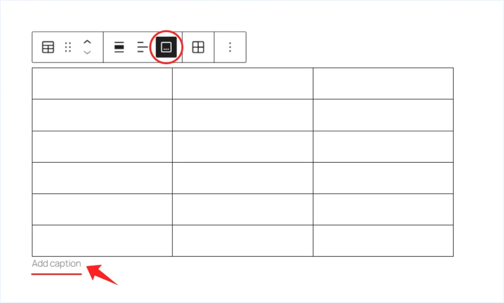
- Add Caption: Add descriptive text below the table to explain its purpose or context.
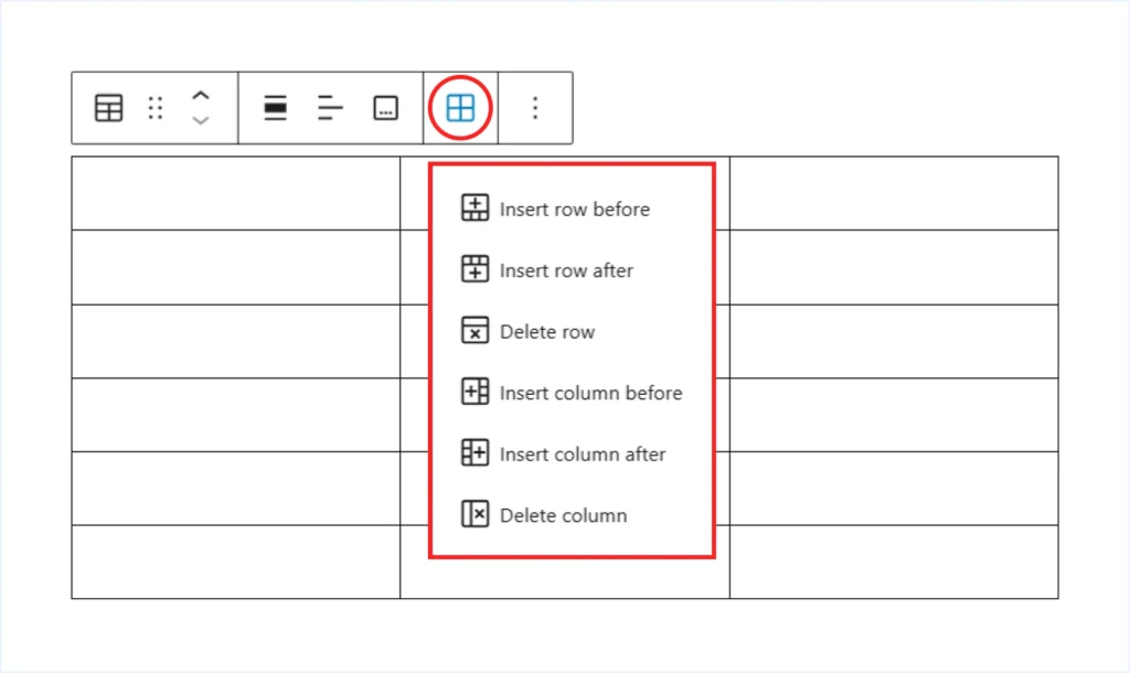
- Edit Table: Insert a row or column before or after the selected cell, or delete the selected row or column.
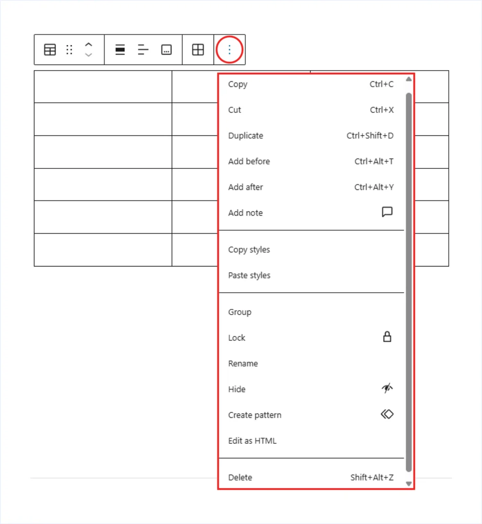
- Three Dot (⋮) Options: Access additional actions such as copy, duplicate, cut, create a reusable pattern, or edit the block as HTML.
Step 3: Add Content
- Add Text: Click inside any table cell and start typing your content.
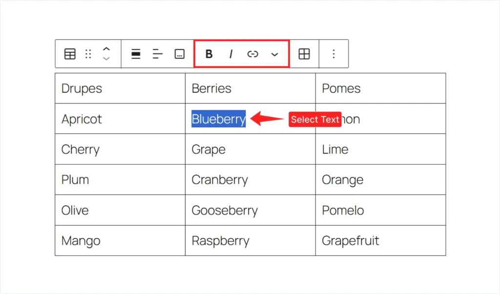
- Quick Text formatting: Select the text inside a cell to access the inline formatting toolbar. From there, you can apply Bold, Italic, or add a Link.
- Add Image: Click inside a table cell, open the More dropdown from the block toolbar, and choose “Inline Image.” Then upload an image from your computer or choose one from the Media Library.
You can also insert other inline elements, such as highlights, inline code, or special characters, using the same method. This gives you more flexibility when presenting structured information inside a table.
Step 4: Customize the Table Block
Click the table block and open the right-side settings panel. Under Block settings, you will find two tabs: Settings and Styles. From here, you can control both the structure and appearance of your table.
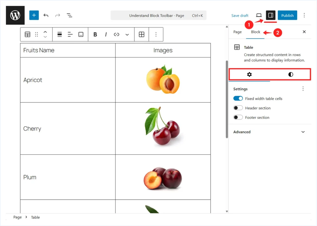
Customization options under the Settings Tab:
- Fixed width Table Cells: Enable this option to make all table cells equal in width, regardless of the amount of content inside them. This is useful when you want a balanced and consistent layout.
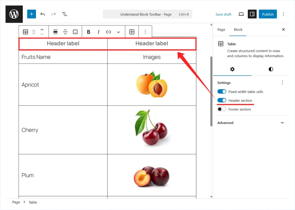
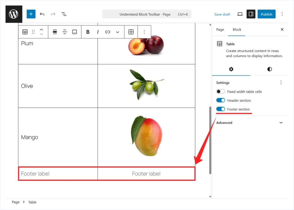
- Header section: Enable this option to add a new header row at the top of the table. A new row will be inserted with placeholder text labeled “Header Label” in each cell. You can then replace these labels with your actual column titles.
- Footer section: Enable this option to add a footer row after the last row of the table. You can use it to summarize totals or add final notes.
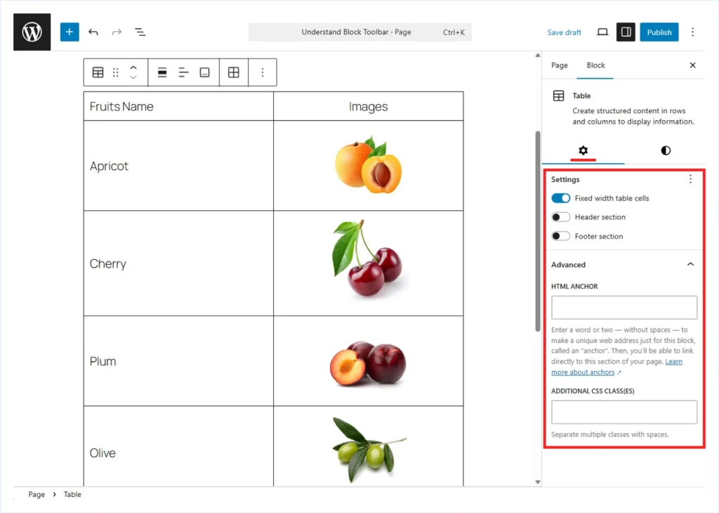
- Advanced: These options provide more technical control over the table block.
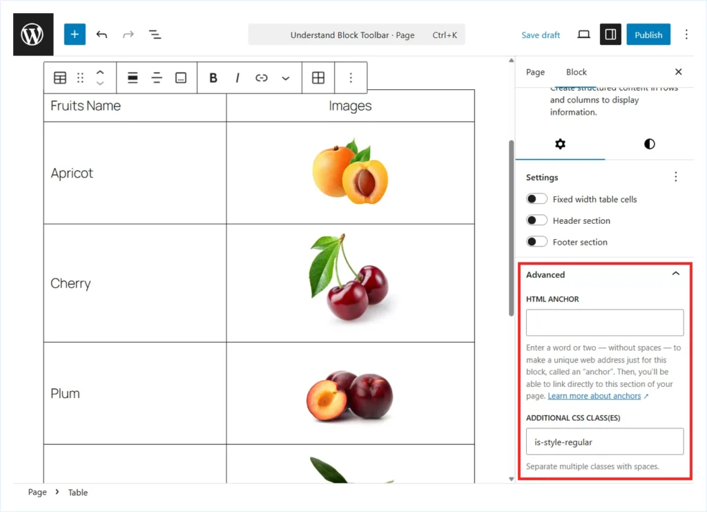
- HTML Anchor: Enter a short word without spaces to create a unique anchor link for this table. This allows you to link directly to the table from other sections of your page.
- Additional CSS Class (ES): Add one or more custom CSS class names separated by spaces. This is helpful if you want to apply custom styling using CSS.
Customization options under the Style tab:
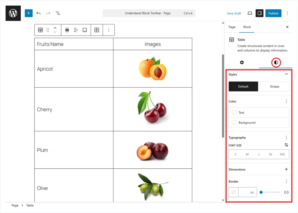
- Styles: Choose “Stripes” to apply alternate background colors to odd and even rows. This makes longer tables easier to read.
- Color: Set the text color and background color using the color picker or by entering a color code.
Note: Changing the text color may also affect the border color. You can manually adjust the border color in the Border settings if needed.
- Typography: Control font size, font family, line height, letter spacing, text decoration, and letter case to match your website design.
ℹ️ Some options in the right-side panel may be hidden by default. Click the (⋮) three-dot menu to reveal additional controls.
- Dimensions: Add padding for inner spacing and margin for outer spacing around the table block. Unlink the sides if you want to apply different values to each side.
- Border: Adjust the border width and color for the table and its cells to refine the overall appearance.
Best Practices for Using the Table Block Effectively
- Use the Table Block to display tabulated content inside posts or pages. Do not use it to create multi-column layouts. Instead, use the Columns or Grid block for layout design.
- Add a Heading or Paragraph block before the table to explain what the table represents. This helps users understand the context before reviewing the data.
- Enable the Header section to clearly define column titles. This improves readability and makes scanning easier.
- Apply Stripes, or alternate row colors, for larger tables. This reduces visual fatigue and helps users follow rows more comfortably.
- Enable the Footer section if you need to summarize totals, conclusions, or final notes at the bottom of the table.
- Add a caption below the table to provide additional context or clarification.
FAQs : WordPress Table Block
The Bottom Line
The WordPress Table Block can be a practical option for presenting data in a structured, tabular format. It works well for simple text-rich tables.
However, it has limitations. You cannot use it to build advanced table layouts such as pricing tables, schedule or booking tables, and similar use cases.
Additionally, you cannot include common elements such as buttons, lists, or star ratings directly inside cells. It also does not support features like merging cells, making the first row or column sticky while scrolling, or applying deeper customization controls.
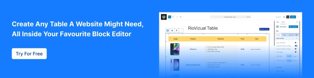
If you need more flexibility and design control, you can use a dedicated table plugin like RioVizual. It extends the default Block Editor with additional elements and layout options, allowing you to create more advanced and interactive tables with ease.

Leave a comment